

We are living in a time of extreme uncertainty, and social media has become the go-to for many users to get news, views, and some relief from the worries of the world.
While there are some general guidelines for creating social media content—such as using a URL shortener to make text posts look more attractive—designing visuals can be challenging.
We share 7 social media design tips that will make it easier to reach your newly revised 2020 goals. They may take some practice to get used to but you will get the hang of them quickly.
1. Simple Designs

Simplicity might seem like the opposite of what you should be doing on social media, but it has its merits.
Remember that most users are checking social media on their phones, which have compact screens and limited space to display complicated imagery.
You don’t want people to have to peer at their screens to deconstruct your image—they will move on to the next post in seconds.
Instead, keep your graphics simple and easy to absorb—you can look at these resources and templates for inspiration on how to create simple but memorable imagery for social media.
One of the major aspects of simple design is the use of white space to separate graphic and text elements—this makes the visual easier on the eye and more attractive.
2. Brand Identity
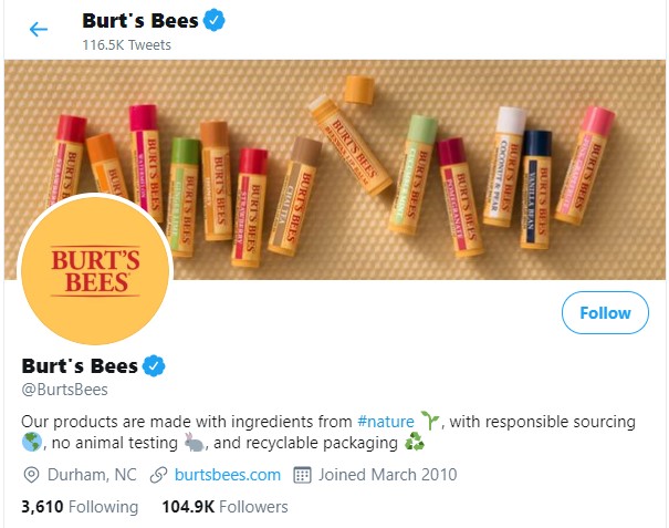
On social media, where several brands are competing with each other for the attention of similar users, it is important to use your branding judiciously in graphics.
Branding on social media is crucial because of the business of the sphere, but also because it improves brand recall—and as a result, sales and revenue.
While branding definitely includes elements like logos, colours, and fonts, stamping your logo on every social media graphic isn’t the only way to be memorable.
It’s too in-your-face and sales-forward—to get traction on social media, you need to be more subtle.
Branding needs to be more about storytelling and the ethos of your company—draw people in with stories that are attractive and relevant.
Don’t just rely on your logo design to make an impression on users—if your content is strong enough to stand on its own, you will make a much bigger impact on social media.
3. Colour Schemes
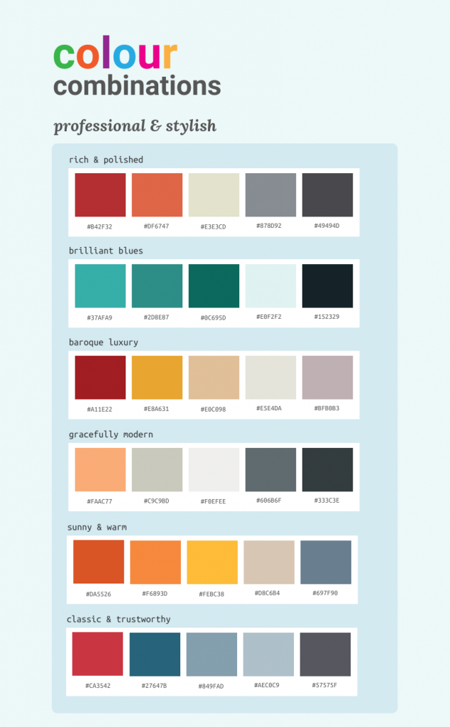
Source: Venngage
Speaking of branding, colour is a powerful aspect of branding—it’s one of those memorable elements that improve brand recall.
But colours can be challenging—they evoke emotions and reactions in users. Choose the right colour scheme and you can make your content stand out.
However, using the wrong colour scheme can negatively impact your messaging—understanding how colour theory works is, therefore, crucial.
While you may want to use the boldest and brightest colours, you need to remember that everyone has the same idea—if you want to stand out, go in the opposite direction.
The way you employ colours is also important—you need to choose high contrasting colours because they are easier to see for readers with visual impairments.
In general, contrasts are pleasing to the eye and easier to pick up, so use contrasting colour palettes whenever possible.
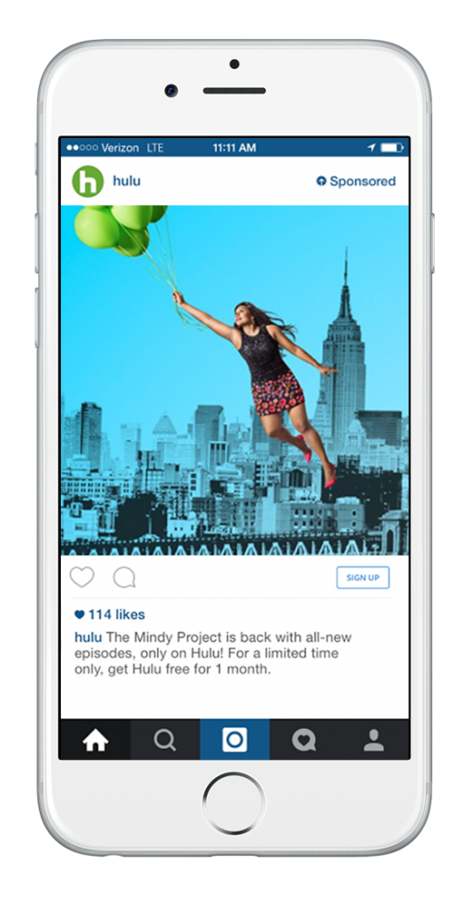
4. Text on Visuals

Source: Venngage
Text has the power to be a great visual in and of itself—depending on the kind of font you use.
Alongside logos and colours, text is an important tool for marketers. Think of brands like Coca Cola or McDonald’s—their font is immediately recognizable.
But the font used for logos tends to be highly stylized—it can’t be used everywhere without being distracting.
Instead, most brands include 2-3 fonts in their style guide that they can on a consistent basis across their graphics, including on social media.
If you do plan to use text in your designs, use them judiciously. Don’t incorporate too much text on an image—remember, you need to keep the graphics simple.
You also want to avoid clutter—too much text will be impossible to read on a small screen. Don’t write paragraphs in a graphic—limit yourself to one select phrase.
Also, keep in mind that you don’t have to create every single visual yourself—use content creation tools to source posts on relevant topics and from trustworthy sources.
5. CTAs
If you want to incorporate text on your social media designs, you should think of limiting it to a call-to-action (CTA).
The text of your social media posts will usually include a CTA—either to visit your website, promote your blog, or to check out your video channel.
A well-written CTA attracts the user’s attention, giving them more reason to read your post and click on the attached link.
But CTAs also do another important job—they tell users the content of the post in a glance.
With attention spans being more limited than usual—considering the current climate—a strong CTA is vital to getting your post the attention it deserves.
6. Adaptable Visuals
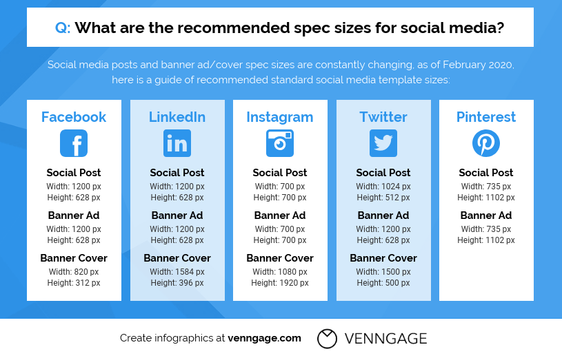
There are numerous platforms in the social media sphere—Facebook, Twitter, and LinkedIn may have been the progenitors, but Instagram, YouTube, Snapchat, and TikTok are the future.
Can you use the designs you create for one platform across all of them? You could, but that isn’t best practice for social media marketing.
Each channel has its own dimensions for visuals—these need to be adhered to so your graphics can be seen in their proper form by the audience on that platform.
Some social media channels also restrict the kind of graphics that can be used—you can employ GIFs on Twitter but not on Instagram.
Facebook, Instagram, and now LinkedIn has native video options.
Snapchat and TikTok thrive on short-form video content, as well as ephemeral content that lasts only a day.
One graphic can be used across these channels but you need to ensure that it is adapted to suit the platform you are posting it to.
You can also repurpose visuals like infographics for more than one post—while an infographic can be posted as-is on Facebook, sections of it would fare better on Twitter.
Understand the social media channels you are using so you can make the content that is best suited for it.
7. Adjust for Audiences
Just as social media platforms have different dimensions, they have varying audiences—your social media designs need to be optimized for the people using the channel.
Facebook is geared towards older generations who want to stay informed. LinkedIn continues to be a haven for professionals.
Twitter has become largely opinion-based and now focuses on storytelling.
Instagram, Snapchat, and TikTok are geared towards younger audiences and are more entertainment-oriented.
You need to use visuals that will attract audiences for those channels. While you can use stock photos across a number of these, strongly consider creating original visuals instead.
According to the latest visual content marketing statistics, 40% of marketers found that original graphics helped them reach their goals, more than videos or stock photos.
With the current environment being so full of uncertainty, creating imagery that is unique and tells a story to the audience of the channel will be more effective in reaching your goals.
Conclusion
Creating strong social media designs is all about understanding the platform, the audience, and ensuring that your visuals are uncluttered but attractive.
It can seem like a tough ask, but these tips will help you streamline the content creation process so that your audience will be attracted to your visuals and help you get back on track to your goals.
Ronita Mohan is a content marketer at Venngage, the online infographic maker and design platform. She enjoys writing about, design, social media, digital marketing, as well as pop culture and diversity.
Twitter: @Venngage
With Crowdfire, you can find curated content, schedule your posts, engage with your audience, deep-dive into analytics and create custom reports. Now introducing Social listening. Try it for free.