

 Posted by
 Mobile-friendliness is one of the most important aspects of running a website. In the first quarter of 2021, nearly 55% of all online traffic came from mobile devices (Statista). Additionally, Google’s new Mobile-First Index means mobile sites are prioritized in the search engine results. This means that making your website mobile-friendly is more important than ever before when it comes to usability and improving your SEO.
In this article, we’re going to outline how you can optimize your website for mobile-friendliness. Let’s get started.
Make your website load speed a priority
Your website load speed should be one of your top priorities. Try to keep it around 2 seconds — any more than that, and you might increase your bounce rate. Your bounce rate is the percentage of visitors that leave your website after visiting just a single page. When your bounce rate is too high, Google and other search engines will assume that your website isn’t very helpful to your visitors, and decrease your rankings in the search results. Furthermore, mobile users tend to be on the go — if your website takes too long to load, they’re likely to move on to the next thing.
If you need help improving your Google rankings through boosting your page load speed, take a look at Google PageSpeed Insights. Plug in your website, and Google will provide you with a list of ways to improve your loading speed, including optimizing your images, reducing JavaScript, and more.
Keep your website’s design clean and simple
Because mobile phone screens tend to be much smaller than those of laptops and desktop computers, you need to ensure that your mobile website design is clean and simple. When designing your mobile website, be sure that your color scheme is simple and you keep each section of your screen to the most vital elements of your website. You can also include a hamburger menu to keep other pages hidden until necessary — this will let you keep different navigational parts of your website without the clutter.
Let’s look at a few different businesses that have gotten their mobile website designs right for inspiration.
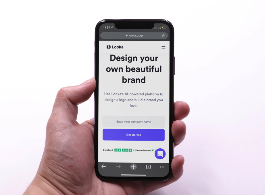
Looka, an online logo maker, has an excellently designed mobile website. Notice how all of the most important elements, including the title, CTA, and a place for the viewer to put their information, are all clearly visible and free of clutter.
It’s very clear to the reader what they should be doing on Looka’s website: designing a brand. On your mobile website, be sure to include your most important information front and center, where the viewer doesn’t have to scroll to see it.

Amazon also has a top-notch mobile website. In a quick glance, you can see all of the most important information: where to sign in, recommended products, and a mobile navigation menu.
Think about what people are immediately looking for when coming to your website; in the case of Amazon, it’s things like movies and TV, Prime deals, and Alexa products. Be sure that, like Amazon has, you’re making sure your most popular products are easy to find on your mobile website.
Make sure your contact options are easy to access
Simplifying your mobile site’s design can mean that you have to remove a lot of elements, but you need to ensure that your contact options are still clear and easy to access so website visitors can get in touch with you if they have any questions. Not only is this important for your mobile-friendliness, but it’s a great way to improve your customer service.
Here are a few ways you can make your contact options easier to access on a mobile device:
- Provide a live chat option so visitors can text customer service
- Include your contact icons and social media pages in your header
- Let people call you straight from your website
- Include a phone number at the top of each webpage
Here is an example of a website that has made their mobile contact options easy to see and access.

My Visa Source, an immigration law firm based out of Canada, makes it very clear to their mobile viewers where they need to go to get in touch. At the top right-hand corner of the screen, there is a phone button that allows the user to quickly and easily make a phone call tot he company. The two bright yellow buttons on the center of the page also tell the user where to go next to ask questions about their destination of choice. Plus, there’s a live chat option highlighted in the bottom corner of the screen.
It’s very easy for website visitors to get in touch, meaning they’re likely to do so quickly if necessary. On your mobile website, be sure to provide immediate ways for your customers to contact your experts or customer service representatives, either through the phone or a live chat service. This will help to move them through your funnel.
Create a helpful and intuitive navigation
When designing your mobile website, you’ll often need to condense your website navigation menu. Be sure to put thought into making it as helpful and intuitive as possible. Many different mobile navigation menus feature larger, vertical layouts that fill the user’s screen when they are opened. Be sure that the clickable area is larger on mobile than desktop, as well — people using their fingers to navigate might have a harder time tapping a smaller link.
You could also consider reorganizing your navigation menu to make it easier for your website visitor to find what they’re looking for. For instance, you could organize parts of your menu by product category, what type of customer someone is, and the like. This is all part of improving the user experience, which will help keep your customers engaged on your website.
Let’s look at an example of a website with a strong mobile menu for inspiration.

Verblio, a digital marketing agency specializing in blog writing services, has created an excellent navigation menu for their mobile website.
If you tap the pink hamburger menu button, visitors can easily choose where to go next, depending on their needs. These different sections can tell the reader what types of services Verblio offers, what industries they work in, and more. On your website, consider organizing your menu in such a way that your website visitors can find the information most specific to their needs. The quicker they can find what they’re looking for, the more likely they’ll be to spend money with you.
Make sure your content is easy to read on mobile devices
Some website owners make the mistake of publishing their website content without checking that it’s going to be readable on mobile devices. Content marketing is one of the most important parts of digital marketing, so it’s vital that all of your website visitors can quickly and easily get the information they need from you.
Here are a few tips to ensuring that your content is readable on mobile:
- Use large fonts and headers
- Include a table of contents so readers can navigate to the information they’re looking for
- Use contrasting backgrounds and font colors
- Include imagery throughout your page to increase engagement and break up blocks of text
- Include large buttons
- Remove text-blocking ads and pop-ups
Let’s look at a few examples of websites that have ensured their content is very readable on mobile.
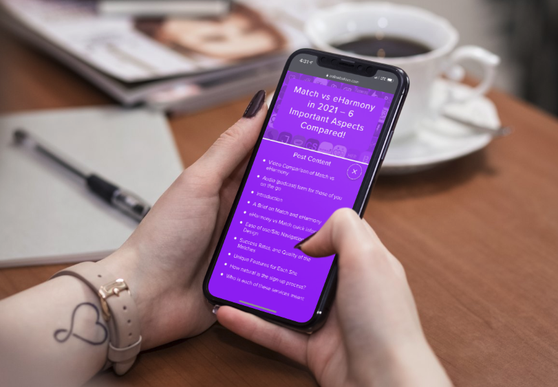
Online For Love, a website that discusses the ins and outs of various dating apps, has a comparison piece on Match vs. eHarmony that is very easy to read and navigate on mobile.
There’s a small list icon at the lower right corner of the page that lets the user open a table of contents linking to various sections of the article. This makes it very easy for the reader to find what particular information they are looking for.
On your website, consider creating something similar, particularly if you publish longer articles — your mobile users will thank you for it.

The Verge, a website specializing in media and tech, has a listicle outlining the best phones of 2021.
Because of its formatting, it’s very easy for users to read and understand the information on a mobile phone. The pink headers stand out from the regular text and background, and there are links to purchase and find reviews for each device.
On your mobile website, make sure that it’s easy for viewers to determine where they need to go to make a purchase or find more information. It can sometimes be harder to browse online with a mobile, so you want to make the process as simple and pain-free as possible.
Optimize your site for mobile search
A lot of people use search engines on their mobile devices, particularly if they’re looking for a product or want the answer to a question. So, you need to optimize your website with mobile search in mind. Compressing images, improving your page loading speed, and removing pop-ups are all great ways to help improve your user experience and ensure that your website will show up in mobile searches.
You need to optimize your content for voice search, as well — with virtual AI, smart home devices, and more becoming increasingly common, over 20% of mobile queries are coming from voice search. So, be sure that you include conversational keywords in your content, like “who”, “what”, “where”, and “why” questions, as that is how people tend to search through a voice assistant. Read your content and copy out loud, as well — it should be concise and easily understood.
Need more help giving your SEO a boost? Take a look at some of the SEO packages that Loganix has to offer. We can help you audit your website, come up with content ideas, build links, and more.
Summary
With smartphones and mobile web searches becoming more and more prominent, your website’s mobile-friendliness is becoming more important than ever. It’s vital that your website is clean, helpful, and intuitive on mobile devices as well as desktops! In this article, we covered how you can optimize your website for mobile devices through navigation, loading speed, design, and more.
Take a look at your mobile website — there’s work to be done!
About the Author:
Adam Steele is the COO at Loganix, an SEO fulfillment partner for agencies and marketers. We build easy-to-use SEO services that help businesses scale. If you liked this article, please check out our SEO guides and templates on the Loganix blog.