

Great content is all about delivering valuable information, right?
Boosting your brand’s reputation, generating goodwill and credibility, urging a visitor towards a lead magnet, even converting a lead into a paying customer – all of these things are possible if you give your readers the knowledge they’re looking for.
But what if I told you that there’s more to delivering knowledge than choosing the right words, images, and media?
What if your website’s design had a huge impact on your content marketing efforts, perhaps even as much as the words themselves?
I’m here to tell you today that your site’s layout, color scheme, typography, image selection, and many other aspects of web design all play a role in making the content you deliver more effective at lead nurturing and conversion.
Let’s take a look at five ways a well-designed site can boost your content marketing success.
1. Choose Incredible Images
You want your content to make a splash. You want it to evoke feelings with your readers. You want it to be memorable. This is achievable with the use of high-impact images that compliment your words.
If you want to ensure better reader engagement and involvement with your content – which is one of the major keys to content marketing success – image quality needs to be super high.
Let’s take Recipe Fairy as an example. The site’s recipe page for Cracker Barrel Meatloaf (yum!) leads with a delicious close-up of the dish.

Image Source: recipefairy.com
This is culinary photography at its best, and it’s used perfectly on this particular page. Most readers invested in making this recipe will feel instantly drawn into the content as soon as they notice this terrific photo.
Another great example is brought to us by Travel Perk. As with Recipe Fairy, this site plays in an industry that feeds off visitors’ emotions. This is why choosing photos of exceptional quality on their travel-related pages is an absolute must.

Image Source: travelperk.com
If nurturing your leads depends on evoking a feeling with your content’s target audience, don’t mess around with bad images. Invest in the good stuff, and the rewards will be there.
2. Embrace Negative Space
Visual clutter is the enemy of engagement. It has the opposite effect of what most marketers are looking to achieve. It distracts readers and makes them feel overwhelmed even before they start interacting with the content. One of the best ways to combat this is by embracing negative space in your design.
Let’s put a fine point on this tactic. By “negative space,” I mean colorless areas on the site that contain absolutely no content whatsoever.
It may seem counterintuitive and like you’re wasting prime real estate, but this is the wrong way to think about design. Consider negative space as an asset that helps readers focus on the content that’s most meaningful to them.
Don’t feel like you need to cram some UI element into every possible piece of available space on your site. It will only serve to distract your reader from what’s important: your content.
Best Mattress Brand’s post on The Best Adjustable Beds of 2021 is a great example of how to utilize white space. The page is incredibly info-heavy, but because the site’s designers used minimal UI clutter, engaging with the page’s content is a breeze.
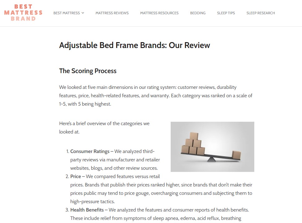
Image Source: Bestmatressbrand.com
So much space! So much focus on the content! Perfect.
3. Break That Wall of Text
People don’t read website content the same way they read a novel. A long, unbroken section of text alienates your average internet user.
When your content is just a boring, sterile, intimidating section of (virtually) neverending text, it will make readers feel as if there’s a barrier between them and your brand.
Content needs to be inviting. It needs to whisper “read more” to your audience as their eyes scan the screen.
To solve this problem, make sure that you start chunking your blog post content.
What is chunking?
Essentially, it’s the process of using various visual elements to visibly separate long sections of text into more accessible portions, or “chunks.”
Typically, the following elements are used:
- Headings and subheadings
- Images and illustrations
- Bullet point lists
- Embedded video
- Graphs and other data visualizations
- Infographics
- Call to action buttons and links
- Quotes
- Social media share triggers
Adbadger’s Amazon PPC Guide is a great example of using chunking to make long sections of text more palatable for readers.
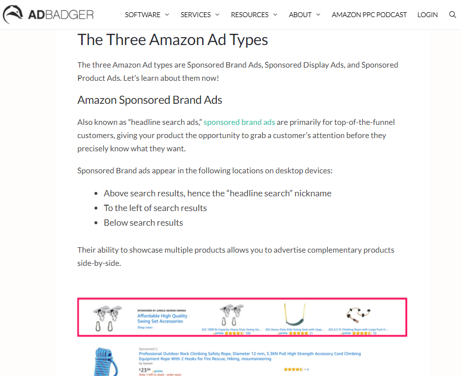
Image Source: Adbadger.com
4. Simplify Content Exploration
Helping your target audience find additional pieces of content that may be of interest to them is a critical part of lead nurturing.
The article that brought them to your site may contain the answers they were initially looking for. However, it might not contain the trigger that gets them to subscribe to your newsletter or makes them sign up for a trial.
This is why all your blog posts should always contain some kind of navigational element which leads to content exploration.
There are a host of smart, subtle ways to do this. One of my favorites comes courtesy of Readme. The site’s blog post on their flagship product’s “Recipe” feature is categorized with content tags labeled: “Developer Experience” and “Product Updates.”

Image Source: Readme.com
Both of these tags are clickable, allowing visitors to quickly and easily access other content pieces in the categories.
These clickable tags are also accessible in the site’s blog index, where users can filter all blog posts simply by clicking on the relevant category link.
5. Establish Brand Credibility on Your Blog Index Page
Your website visitors need to get the impression that your company has a consistent approach to content marketing. This goes a long way towards building brand credibility and generating trust with your potential customers.
Your blog’s index page is an excellent space to do this.
When visitors see that they’re interacting with a brand that publishes frequently, uses bespoke visuals, maintains a consistent tone, and covers a very specific niche, they become confident in the company’s capacity to help them.
Take a look at how Aircall designed their blog index page, and you’ll see a company that takes content marketing consistency to the next level.
- Each post has a meaningful preview image that’s obviously been created specifically for the content piece.
- Visible publish dates make it clear that several posts go live every month.
- Smart previews that expand on mouse-over shows allow the user to see that each content piece’s topic is relevant to the brand.
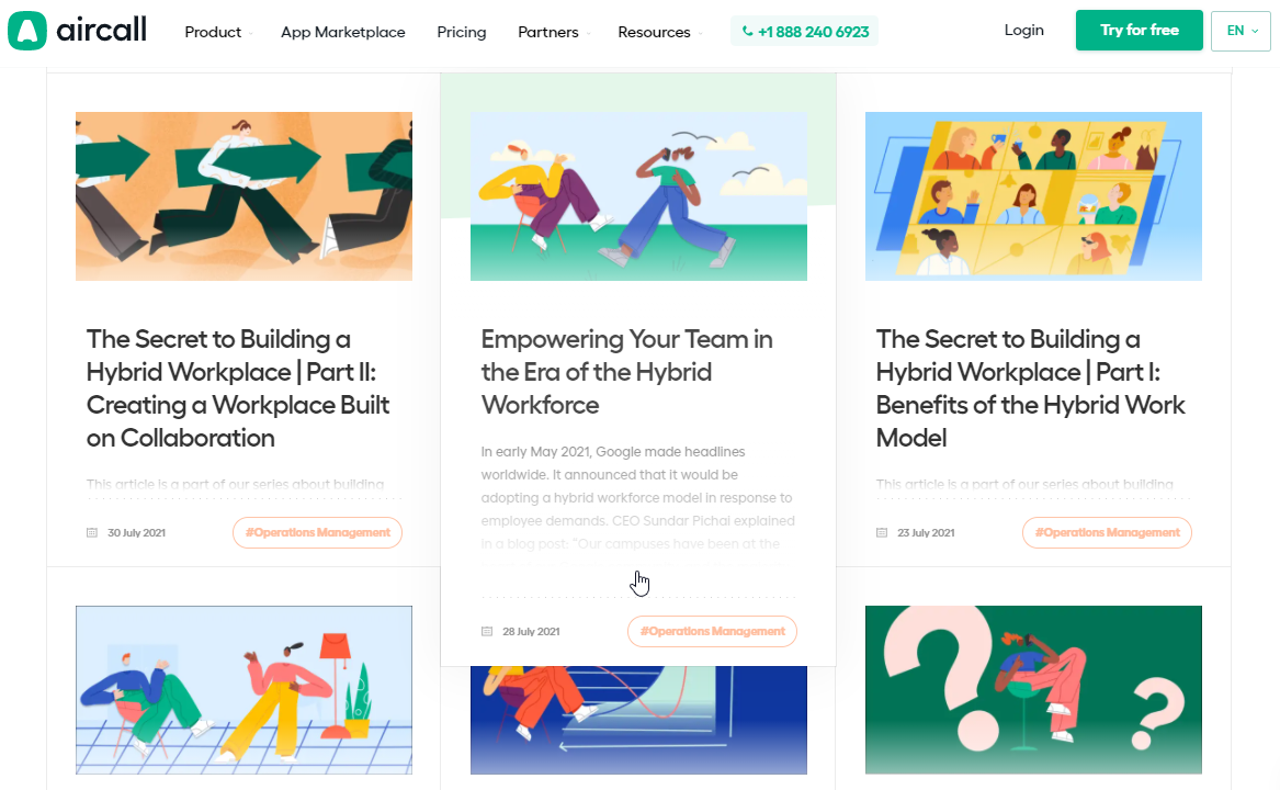
Image Source: Aircall.com
Some Final Thoughts
Writing great content is a large part of effective content marketing. Arguably the most important part.
But in a hyper-competitive world where marketers need to exploit every single edge at their disposal, you need to do more than simply publish the right words in the right order.
Smart web design plays a huge role in bettering your content marketing efforts – almost to the point where you can’t separate the two concepts.
Design is an inextricable part of content marketing. Embrace this concept. Infuse all of your content marketing efforts with amazing visual choices, and your efforts in this space will help you rise to the top.
With Crowdfire, you can find curated content, schedule your posts, engage with your audience, deep-dive into analytics and create custom reports. Now introducing Social listening. Try it for free.