
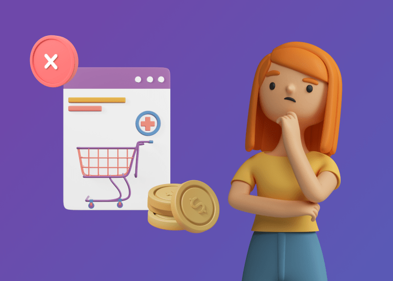
The B2B marketing landscape is getting increasingly competitive. And as over 50% of buyers consider content a crucial element of their decision-making process, and considering that nearly half of B2B researchers are millennials — it becomes quite clear that your website needs to become a conversion-heavy touchpoint.
Unfortunately, many B2B websites still make the same kinds of mistakes. These mistakes are likely to kill a sale even before you get the chance to pitch your packages.
Let’s look at 6 common mistakes on B2B websites and how they can be avoided.
1. Devaluing Human Contact
Your website is an incredibly important marketing tool, and it can certainly serve as a basis for the majority of your sales. However, you can’t expect it to do everything on its own.
Of course, writing convincing, persuasive, informative, and detailed sales copy is vital. But you will never be able to assuage every doubt, cover every feature, and personalize your writing so that all of your clients are instantly converted.
A lot of businesses have numerous checks and balances in place, which makes taking on a new service provider a complex and lengthy task. There will be chains of command and several layers of approval to breakthrough.
B2B buyers and their higher-ups will often have questions that need to be answered in person before a purchase can be made. They’ll want to hear from a human, and they’ll often want to add or remove certain features or negotiate the price.
If it’s difficult to reach a human sales rep, these buyers are likely to lose interest. They will simply continue their search for the perfect provider.
The solution to this problem can be quite simple: stop hiding behind an electronic, faceless ordering process. Make it incredibly easy for your leads to get in touch. Turn your CTAs into “get in touch” rather than “buy now.”
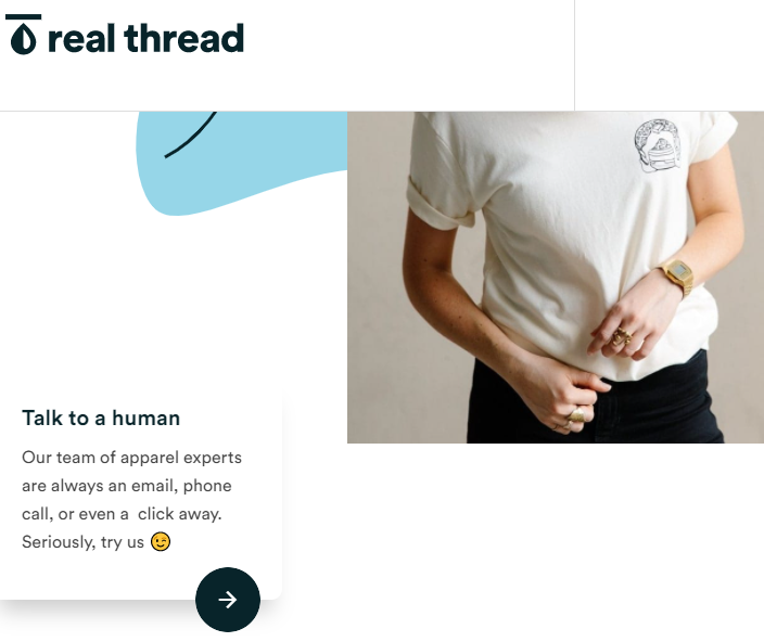
Take a look at Real Thread and how they have opened up communication with their buyers. All it took was a “Talk to a Human” CTA button right below their website’s hero header. The page it takes you to has a human face (major plus!) and offers several ways of contacting the brand.
Featuring your phone number in the header or footer of your website and adding a human-oriented CTA can make all the difference.
2. Not Being Clear Enough About What You Do
B2B products can sometimes be very complex. There are features, objectives, and packages that can easily make a buyer’s head spin.
If the people who land on your website walk away without taking in your key message, or worse still, without understanding what it is you do, your website needs to be revamped as soon as possible.
Needless to say, the solution to this issue lies in better copywriting. Start by distilling your offer down to its very core, and build up from there. Crafting a sentence or two about your business and offer can be a great starting point.
Don’t forget that you also need to speak the language of your buyers, especially if your product is in any way niche.
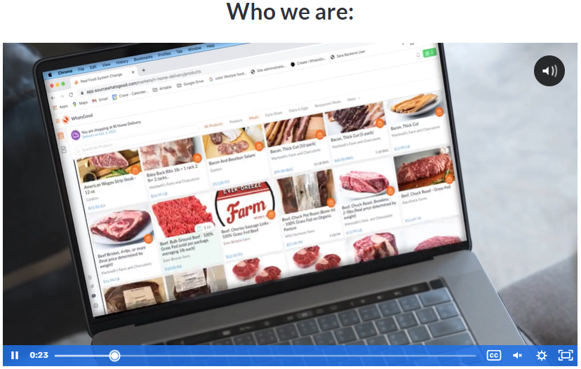
Another way to deliver a better sales pitch and communicate your core solution is to feature a great explainer video on your homepage. An explainer video can work as a supplement to your written content. It should focus on the main pain points and the key hurdles a buyer may need to overcome when considering your offer.
WhatsGood features just this kind of video. It’s not too lengthy (just 2.40 minutes), and it augments the page very well. After all, seeing the benefits of their service and what the process looks like is much more impactful than spelling it out.
Remember that the video can’t be your only effective pitch. You need to outline your key features, values, mission, and the benefits of using your service in words as well. Not everyone will want to watch your video, but if they like what they’ve read, they’ll likely want to learn more.
3. Not Being Upfront About the Benefits
Early-stage business buyers will always want to know what’s in it for them. After all, they need to sell your solution to the decision-makers in their own company, and they will have a much easier time selling benefits than features.
As will you.
The rewards they can expect will always be a better selling point than what a specific product can do. To put it very bluntly, who cares what the product does or how it was made if it can’t achieve the goals it was purchased to achieve?
Your product may be chock full of benefits, and it might be the best solution available on the market. But if you waste screen real estate on explaining its intricacies, as opposed to explaining what it can do for your buyers, it will tank.
Solution-based marketing is the obvious solution. Be mindful not to sound too sales-y (or sleazy), as that will backfire just as quickly. Your focus is always on the customer and what they can expect to get out of doing business with you.
A good example of this kind of copywriting and page design can be found on the Optimal Workshop homepage. All the copy, imagery, and video puts the customer first and clearly shows the benefits of working with the brand. From the tagline to the CTAs, the customer will always understand what’s in it for them.
4. Not Speaking Directly to Specific Customers
Business buyers need to be able to relate to the problems and pain points your product is here to solve. They need to see how a solution will work for them specifically.
Writing generic copy is, however, your only resort when it comes to your key landing pages — unless you’re marketing to a tiny slice of a larger target market. In the case of the latter, you can get away with being quite specific throughout your pages.
However, in most cases, your client base will be varied and diverse. Because of that, you’ll need to build on top of your more general content.
This is where use cases come into play. They are a great hook for potential customers, as they can demonstrate the variety of your solutions. Lay them out quickly and clearly in your page’s copy, and don’t go overboard. Focus only on the features that fit into the specific case, and don’t mention any of the others.
Time Tackle features four use cases on their homepage, where they break down their different types of customers. The blurbs are concise, but they link out to a page designed to convert precisely this kind of customer. Now, there’s a clever solution for the personalization conundrum.
5. Sharing Too Much Information
Information overload and decision-making paralysis are both a sure way to ruin your chances of making a conversion. While you understandably want to share all the necessary and relevant information, you need to do it in as few words as possible.
In fact, you should also limit the amount of information you share. The human brain will literally stop taking new data onboard at a certain point, and you don’t want to waste your chances by spreading your audience’s attention too thin.
Your best course of action is always to stick to the basics. Let your buyers discover the product for themselves. If you build your website correctly, they will have plenty of pages to read through. They won’t need to be served everything within one landing page.
Better yet, if you can let them try the product out with no strings attached, they’ll be much more likely to come back after the demo and become paying customers.
This is what Flamingo does. The website is super simple, but it allows users to sign up for a free trial without a credit card. This simple CTA is highly effective, as it provides an instant chance at testing out the brand’s claims.
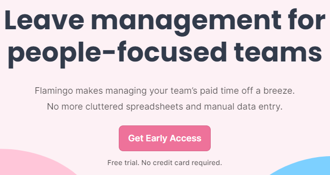
Flamingo is obviously very confident in its product and ready to share it with the world. The brand knows full well that a lot of its initial testers will want to return in the future.
6. Forgetting to Build Trust
Trust and credibility are incredibly important in the B2B world. If a buyer feels they can’t trust you, you are not at all likely to convince them otherwise. This is why it’s of paramount importance to ensure your website eliminates all doubts and inspires the required level of trust for them to get in touch with you.
Social proof is your way of proving that you’re a legitimate business. You can feature industry awards, testimonials from clients big and small, or trust badges from reputable third-party websites that are specific to your industry. Whatever you opt for, make sure to highlight all the social proof prominently on your landing page.
Don’t forget about the power of social media, either. Provide links to your social profiles so that a buyer can get to see your more sociable side. Let them see you as more human and determine whether you are a good fit for each other.
Asana has a decent amount of social proof on its website. The footer points to all of the brand’s social media accounts, and there are also some very personal customer testimonials (with images and job titles).
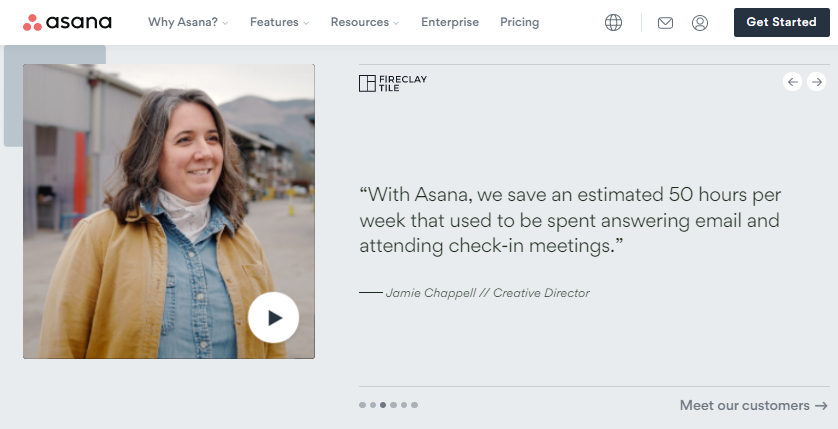
There’s even a customer-specific page, where they not only list some of the major brands that use Asana but also feature a plethora of case studies that will convince any buyer to give it a try.
Final Thoughts
Any of these website design and copywriting mistakes can lose you valuable sales. Take a long hard look at your website to make sure one of them hasn’t slipped between the cracks. Perhaps you will uncover some additional room for improvement that can help you further build your brand and reputation.