

Picture this: you’ve just crushed your quarter. You’ve hit every goal that leadership has thrown at you. You’ve exceeded expectations, and your social channels are thriving. You are living, knowing all of your hard work has paid off.
You receive an email from leadership asking you to put together a presentation to showcase your work. Umm? What? Presentations aren’t really your thing.
Don’t worry; this article has got you covered.
We’re about to dive into six secrets they don’t teach you in school to building a presentation that turns heads in the right direction.
Six secrets to creating a presentation that’s as awesome as you
Presentations aren’t easy. Yet, it’s the harsh truth of our work. If we can’t showcase what we’ve done well, then our efforts are often overlooked. It’s kind of like Instagram in its earliest years—if that brunch wasn’t uploaded to your feed, did you even have it?
Lucky for you, there are a few presentation hacks that we’ll share today to help you create a rocking presentation. In this article, we’ll guide you through the top presentation secrets to ensure your work gets the airtime it deserves.
1. Get on brand

First thing’s first. If you want people to relate to your presentation, you need to present something familiar to them. By making the effort to use brand colours or templates and including brand fonts, logos, and writing style, your audience will automatically side with you.
Psychologically, in-house branding helps to unite you as the presenter and your audience. Suddenly, it’s not you representing your work. It’s you representing the business’s work.
This use of branding leads to any problems or challenges that arise not solely being yours to work on; it transforms into a group effort.
Top Tip: Create an in-house presentation template to make this step easier for everyone.
2. Incorporate title slides

Title slides are a fantastic way to add breathing space to your presentation. They give your audience a few moments to digest.
Title slides also give people time to prepare for what’s to come; they can make that switch in their mind from what they’ve just seen to the upcoming subject.
Title slides are a way of not overwhelming your audience with information. They help to break your data up into more digestible chunks.
Lastly, title slides help to bring pattern and unity to your presentation. Pattern recognition allows the people to process information better, and feel more at ease with what’s in front of them.
Top Tip: Use minimal wording on title slides. They’re a visual brain break.
3. Ask questions
The oldest trick in the book. Whether they’re rhetorical or not, questions get people’s attention. Why? Because people feel responsible for your presentation to continue.
Use questions wisely in your presentation. Whether you use them verbally or in the presentation text as prompts, they can do wonders for getting people to sit up in their chairs, inspiring thought and engagement.
Secondly, if you want people to walk away from your presentation feeling connected and like they’ve learned something, then you want them to walk away asking questions of their own.
These questions shouldn’t be questions about the clarity of the information. These questions should be ones that you spark because of the data and ideas presented. Your attendees should walk away thinking about what they can do with this new-found knowledge. Attendees will want to discover how they can use it to benefit their roles and responsibilities.
Top Tip: Use the 5 W’s to introduce ideas & campaigns: What, Who, Where, When & Why.
4. Try colour psychology
Colour is a powerful thing. Different colours play a key role in how our minds work and the emotions we feel. Use colour psychology in your presentations to generate the feelings you want to create from your audience, both toward yourself and your work.
Consider the topic at hand and the goal of your presentation. Are you presenting a report? Are you kicking off a project? Perhaps you’re trying to win a budget proposal for that social analytics tool you’ve been dreaming about. Think about the emotions you need your audience to feel to help them engage with the topic at hand and get them on the side.
Yellow: Optimism, clarity & warmth. Best for new projects and onboardings.
Orange: Friendly, cheerful & confident. Best for client pitches and internal operations.
Red: Excitement, youthful & bold. Best for dramatic announcements and campaigns.
Purple: Creative, imaginative & wise. Best for leadership and creative marketing efforts.
Blue: Trustful, dependable & strong. Best for research, data, and opinions.
Green: Peaceful, growth & healthy. Best for CSR, predictions, and trends.
Grey: Balanced, neutral & calm. Best for pitches, data-orientated results, and wrap-ups.
Top Tip: Just because you have strong brand colours doesn’t mean you can’t use colours or palettes around them.
5. Use presentation tools
Just because you’re responsible for building this presentation doesn’t mean you can’t call in a little bit of help, and we’re not referring to your over-worked designer that just wants to take a coffee break in peace!
There are plenty of fantastic presentation tools out there to help you create a presentation as smooth as the rest of your skillset.
Here are some of our favourites:
PiktoChart: Web-based, drag & drop, visual design software: everything from presentation infographics to social media story templates.
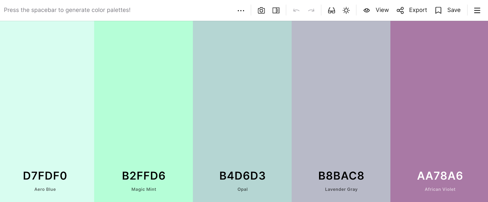

Coolors: Color palette generator: work from an image, brand colours, or pick a palette at random.
The Noun Project: Free icons & photos library: search and source visuals when lacking a relevant image.

Fonts Ninja: A font-finder plug-in or app: search, try, source, and buy any font you like the look of on the web.
6. Keep it concise
Our average global attention span is just eight seconds. Of course, we’re not expecting you to squeeze a presentation into eight seconds, although if you can, we certainly want to hear about it.
What you can do is chop your presentation points up into these concise, digestible snippets that are conscious of our ever-decreasing attention span. When put into a conversation, eight seconds is a surprisingly long time to talk. Try it out. You’ve got quite a bit of time there.
Keep your points short, sweet, and within this 8-second timeframe when delivering. After each point or sentence string, pause and allow your presentation viewers to process what’s just happened.
Pro Tip: Don’t be scared of silence. Used well, it can be just as powerful as what you say.
Wrapping it all up
That’s a wrap on six secrets to creating an engaging presentation. Hopefully, you’ve discovered some new tools and tips to guide you when creating that next presentation for your work. Like we mentioned in the introduction, if we can’t accurately showcase what we’ve done, it can be hard to get credit for it.
Adopt these tips and tools into your every day. Whether you’re creating presentations, on the phone to clients, or even writing emails. Some of these techniques are transferable and can come in surprisingly handy for other moments you’re interacting with people. Plus, if you’ve got a tool or trick of your own, we’d love to hear it in the comments below.
Happy presenting!
With Crowdfire, you can find curated content, schedule your posts, engage with your audience, deep-dive into analytics and create custom reports. Now introducing Social listening. Try it for free.