

Web design is about so much more than making a website look nice. When approached correctly, it can help you direct your visitors from page to page, showcase who you are as a brand and what you stand for, and help you improve your conversion rates.
In fact, there are numerous web design elements that more or less directly impact conversions. Let’s take a look at six of them.

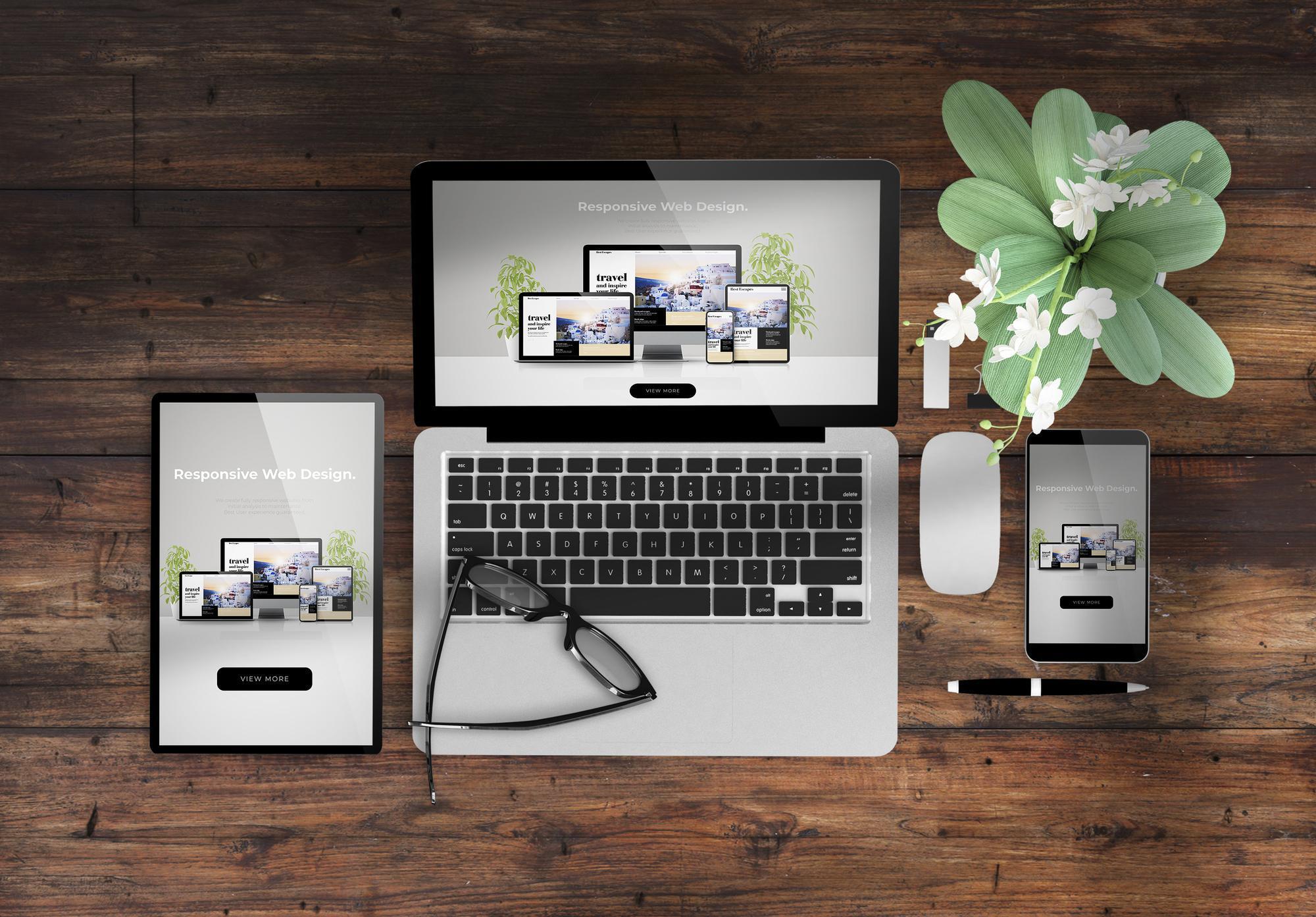
Source: depositphotos.com
1. Use Plenty of White Space
Negative space, also known as white space, has become one of the most recognizable features of modern web design. A lot of websites in the 90s and early 2000s used to involve a black background and a white (or even worse, a colourful) font.
Luckily, those days are far behind us, and most websites now mix whites and colours as backgrounds, cleverly directing the gaze of their audience.
Don’t think of it as empty space that needs to be filled. Think of it as a border that makes the more important elements of your page stand out. When surrounded by negative space, your copy and your visuals will be that much more noticeable.
Finli uses a combination of blue hues, greys, and white to divide their page into sections, draw attention to their CTAs, and allow their images to shine. Yet the page never appears either empty or dull.
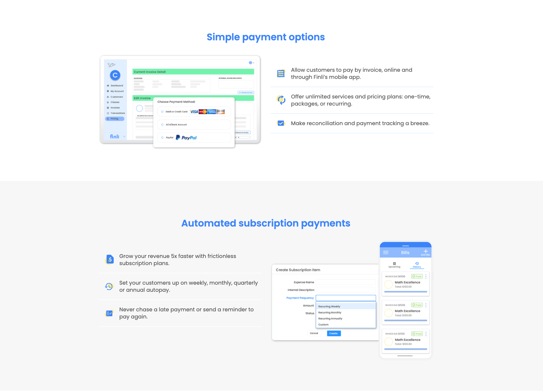
Source: finli.com
2. Have a Pop of Colour
Speaking of white, let’s quickly touch upon the use of colour.
White is certainly a colour you shouldn’t spare, but this does not mean you are not allowed to have a vibrant and colourful website. In fact, you can make the hero section itself pop. Here’s Mailchimp and their bright yellow hero.
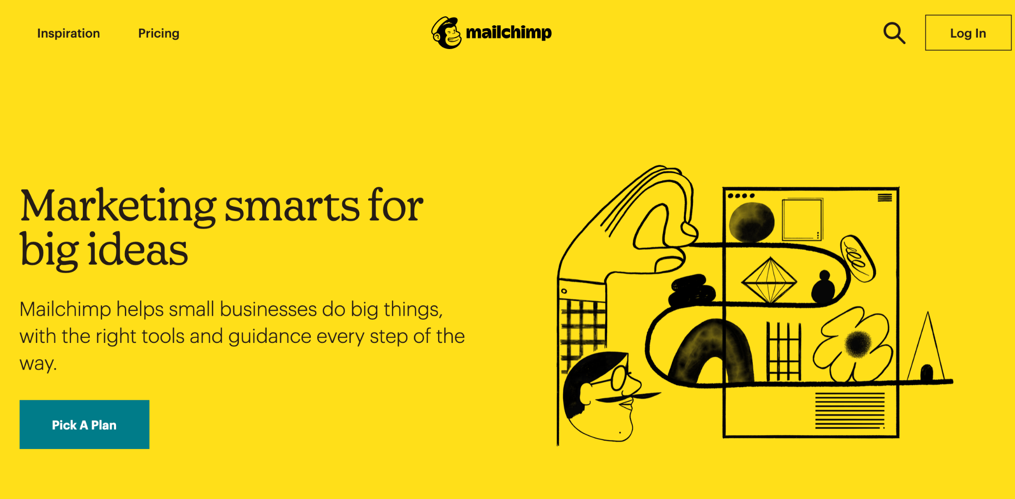
Source: mailchimp.com
The only thing you need to bear in mind when choosing the colour scheme for your website is how it aligns with your brand and how attractive it will be for your target audience. And you are most definitely allowed to think outside the box. Just because you are in the eco-space doesn’t mean the website needs to be green.
3. Use Quality Images
The images you use simply need to be outstanding. Long gone are the days when quality imagery was expensive to source and impossible to produce on your own. Whether it’s product shots or illustrations, they are easier to access than ever before.
Remember that one of the main purposes of the images you use is storytelling. They need to be more than just a visual representation of something. They need to at a glance show your audience who you are and what they can expect if they choose to do business with you.
Let’s take a look at an example. Quip has all kinds of images on their homepage. They show the product in use, in a still shot, and for size reference, in a user’s hand, all in their hero section. They then do some animated shots of the product, finally ending with one image that sums up their philosophy very well – clever products for better oral care.
4. Use Charts and Graphs
Sometimes you need more than just images to best illustrate certain points. For example, size charts or illustrations which provide detailed measurements will always work best for products where size matters.
You can also offer charts that compare similar products, so your potential customers don’t have to make the comparisons manually. You can even compare your product to other products on the market, if you’re not infringing any copyright.
Here’s a page from LFA Capsule Fillers that features several useful charts.
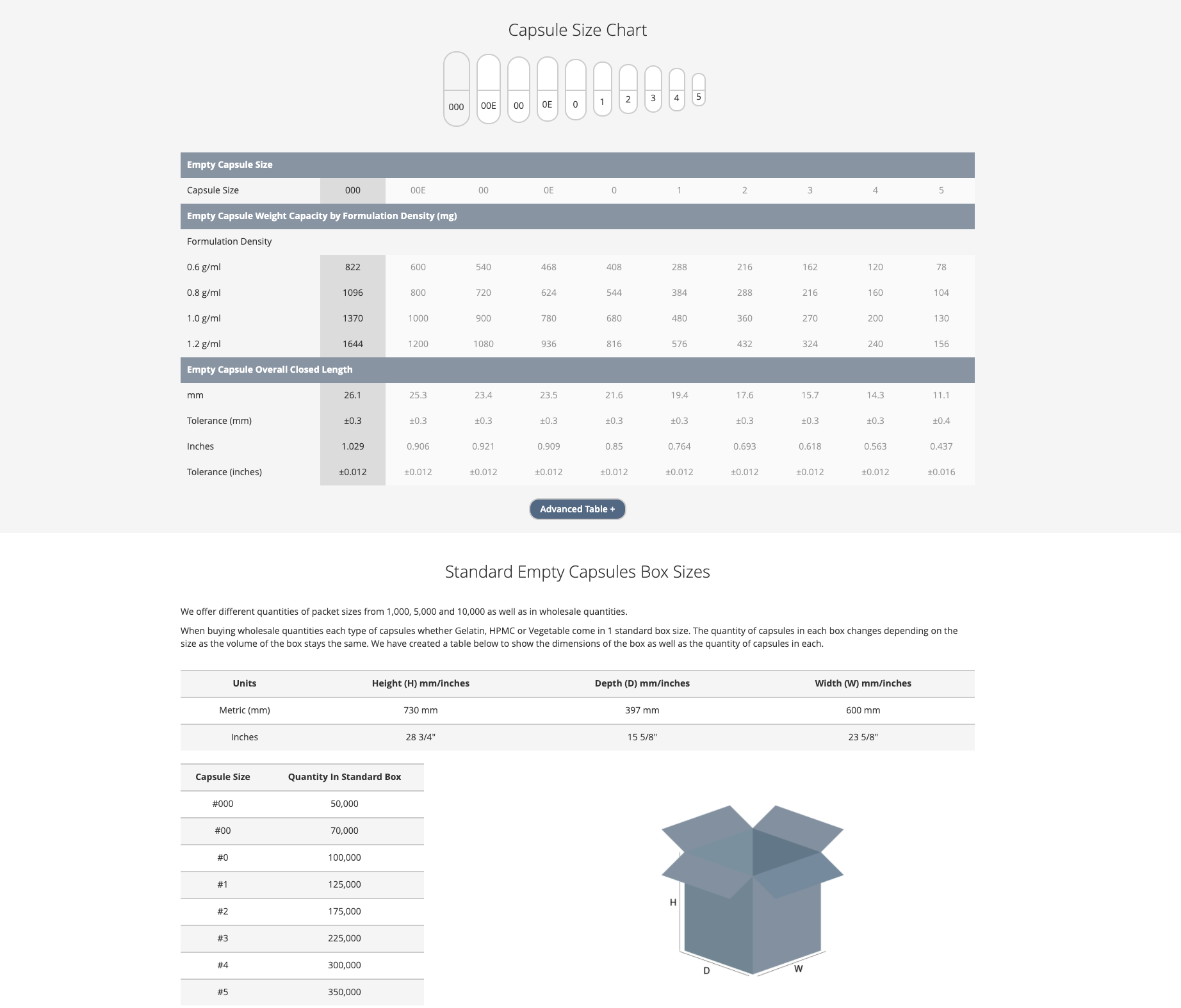
Source: lfacapsulefillers.com
They compare different kinds of capsules, they offer a capsule size chart, and they even tell you how many of them fit into what size box.
5. Use Real People
While we’re still on the subject of visuals, we have to emphasize the importance of using real people in your images.
If your business is based around you as a person, you naturally want yourself to appear in most of your visuals. Here’s an example of influencer Lydia Millen – she shoots her own content and features herself in practically all her posts.
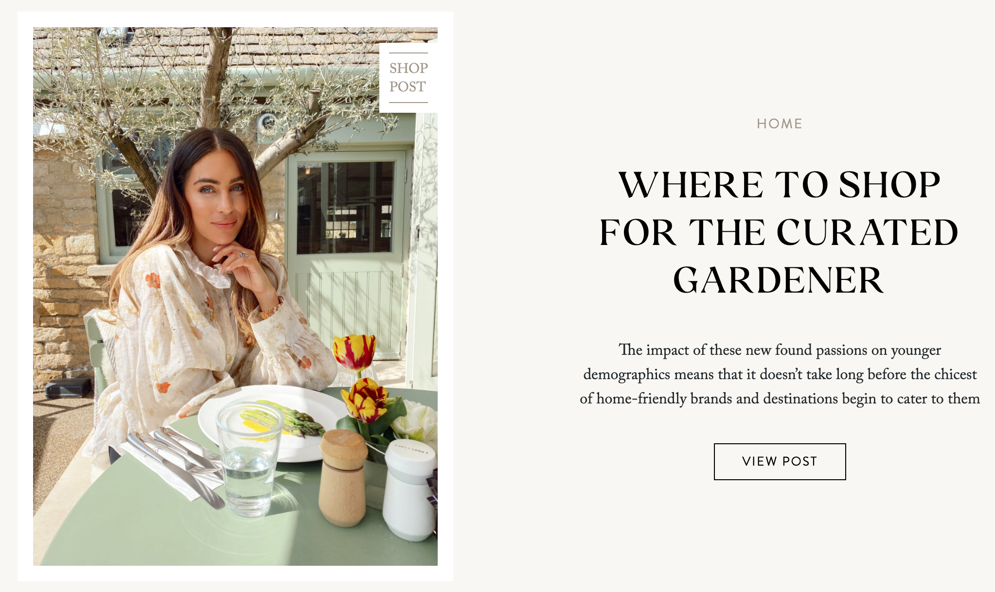
Source: lydiaelisemillen.com
On the other hand, if you are a brand that doesn’t want to attach a specific face to its name, you can use models. In that case, make sure to have inclusivity on your mind. Consumers want to see all skin tones, ages, and cultural backgrounds represented. So, make sure the images you use (especially if they are stock images) aren’t representative of one skin tone and one age group alone.
Dove is a brand that does this really well, and they’ve even launched their self-esteem project. However, the diversity and inclusivity rule does not apply to beauty and fashion brands alone, and you definitely want to embrace it before your customers complain about a lack of it.
6. Make the CTA Stand Out
Naturally, you want to make the main conversion-boosting element on your website stand out. Your CTAs need to pop. Remember, you want the CTA to be the first thing a visitor sees on the page. But equally importantly, a CTA should explain exactly what will happen when a user clicks on it.
Start by using either a contrasting or a darker shade of the same colour you have used on the rest of the page. You can also use bolder fonts, different fonts, make the font larger, but without going overboard. You want the CTA to be a part of the page, albeit the most prominent one.
If you have more than one kind of CTA on the page (for instance, for a free trial and signing up for your newsletter), always make the more important one more prominent. Also, make sure these two CTA differ from one another, so visitors can be clear they lead to different actions.
Ecopreneurist has a bright orange CTA on their homepage, and they use the same design throughout, ensuring continuity and ease of use. Giving your audience more than one chance to convert is key. So, use at least three CTAs on a page you’re driving traffic to.
Final Thoughts
Source: depositphotos.com
With the clever use of these web design principles, you will be able to boost your conversion rates and improve your bottom line. However, always remember that you need to test your theories. Ensure that the page can work well for your target audience before you leave it be and let it do its magic.
If you discover a certain element is not performing as well as you’d hoped, tweak it until you find the format that works and converts.