
Take a look at this email snippet.

Do you find it difficult to discern the word “Get” in the white background?
Well, that’s exactly why email typography plays an important role in getting across your message.
There was a time when Unicode ASCII was the only font available for displaying information in digital media, including emails. Thankfully, technological advancements have made it possible to incorporate different font styles in emails.
Through this article, we shall understand the different font faces you can use in your emails and their compatibility with email clients.
Let’s start.
Different types of fonts in emails
There are four types of fonts that you can use in the emails, namely:
1. Serif
Serif fonts have letters that have flourishes, points, and shapes at the ends of their strokes. If you are writing a professional lead nurturing email to your B2B client, serif fonts are the best pick. They look formal with well-spaced characters and appropriate line spacing. They enhance the email readability and make it easy for the readers to take action.
Some examples of Serif fonts are Times New Roman, MS Serif, and Georgia.
2. Sans Serif
Sans Serif fonts don’t have any artistic embellishments attached to them. They have a semi-formal look that symbolizes practicality over aesthetics. Arial, Tahoma, Trebuchet MS, Roboto, Verdana, and Open Sans are examples of Sans Serif fonts.
3. Monospaced
Fonts like Courier fall in this category. They emulate typewriter fonts and have a block or slab between the letters. These fonts are hardly used in an HTML email. However, they are most commonly preferred as fallback fonts. They exude a feeling of reading official documents issued by the government. So, you must avoid such fonts as much as possible.
4. Calligraphy
If you want to remind the users of handwritten letters from the yesteryears, use calligraphy fonts. They have a flowing movement which makes them fun to read. However, use them judiciously as they can be exhausting to read on a digital medium. Use these fonts in occasion-based email marketing to stand out and highlight the offer. Brands take the help of these fancy fonts in headings or logos as static images.
With that said, we shall now discuss actionable tips to select the right fonts in emails:
1. Select the primary font and fallback fonts
As far as readability is concerned, Serif and Sans Serif are most commonly used for emails. There are a number of fonts you can choose from but marketers extensively use web-safe fonts. If you want to use custom fonts, you have to add a suitable fallback so that there are no rendering issues.
Take a look at this code to understand this better.
<td class=“fallback-font” style=”font-family: ‘Montserrat’, Arial, sans-serif;”> Test </td>
According to this code, the email rendering engines will check if the custom font is downloaded on the concerned device. If not, they will render the fallback font.
How to choose the fallback font?
The fallback font should conform to the following factors:
X-height: The height is the space between the baseline and the midpoint. It is the height of the lowercase letter x.
Kerning: Kerning is the spacing between two letters.
Take a look at this table to get a clear idea of the font and its corresponding fallback.
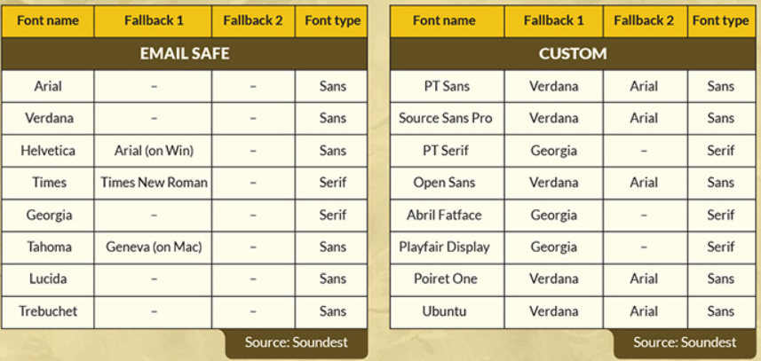
Pro-tip: As Outlook overrides any specified font to render in Times New Roman, you will need to provide an additional code to force the fallback font.
Levels of Fallback Fonts:
According to this image, if the specified font is unavailable, the email client will render the next font specified in the code. In case the next font is unavailable, it will render the system-based fonts as the final fallback.

2. The fonts should be from the same family
All fonts in an email should be from the same family. You can then create different effects in the email copy without having to use a new font from another family.
3. Maintain an optimum line width
Your subscribers will just skim the long sentences. To make sure that they read your email, keep the line width of 35 characters or 6 words of 12–14px font size. It will be easier to read on desktop as well as mobile devices.
4. Designate the right line spacing
Lines that are too closely placed will make the email look cluttered. The subscriber might end up reading the same line two times. Therefore, you must maintain appropriate line spacing of around 1.5 times the font size.
5. Reinforce the visual hierarchy through your typography
Visual hierarchy is all about selecting the right font face, its right-sizing, and alignment, and making the copy easily readable for your subscribers.
According to the email accessibility best practices, your copy should have a minimum font size of 14px to 16px. For fonts with a large x-height, 14px would work well. 16px is preferred for fonts with a standard x-height.
The colors of the font also play an important role in drawing the attention of the readers. Most emails we come across have dark text placed against light backgrounds. With dark mode settings getting more popular in recent times, people prefer light text over dark backgrounds. As dark themes are easier on the eyes, you must consider creating dark mode-compatible emails and choose the typography accordingly. As a best practice, use contrasting colors for the text and background so that there are no readability issues
Left-aligned text is easy to read for everyone, including patients with dyslexia. However, with most emails being opened on handheld devices, marketers opt for center-aligned text.
White space is another important factor that influences typography and email readability. There are two types of white space, namely active and passive.
Active white space is the negative space surrounding the important email elements, like the logo or CTA. Passive white space is the negative space that encircles the entire email template and separates different sections.
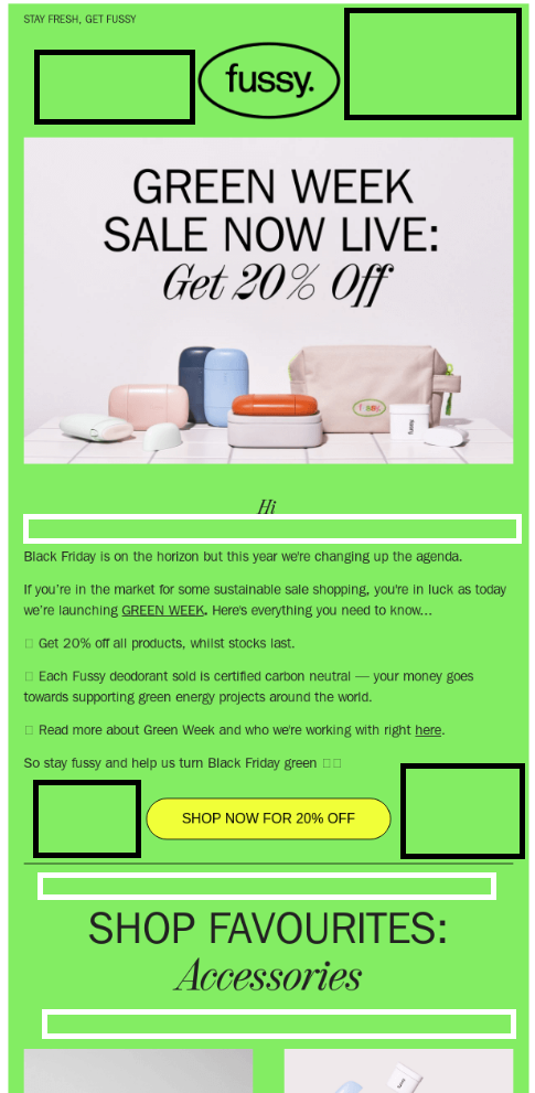
Take a look at this screenshot that demonstrates the difference between the two types of white space.
The sections in black outline active white space while the ones in white outline passive white space.
Another factor you must consider is the color of the links. Formatting the links differently makes them stand out and brings a higher click-through rate.
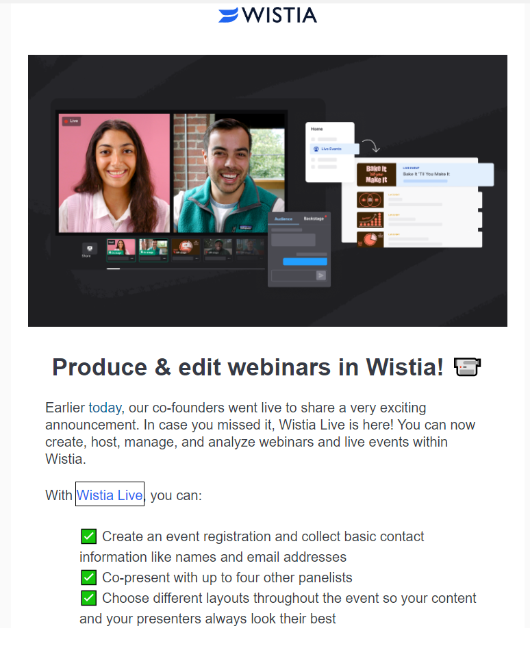
Take a look at this email in which they have formatted Wistia Live in a blue color to bring it to the spotlight.
6. Strike the right balance between typographic text and images
Never send an image-only email as it can trigger spam filters. Text to image ratio should be 80:20.
Check out this email by Harry’s that maintains the right text: image ratio.

Wrapping Up
The presentation of your email copy is as important as its language and tone. Set the typography in such a way that it enhances your brand personality and helps you get higher conversions. You can also try out new innovations in your typography to leave a deeper impact on your readers. It is possible to animate the typography with the help of GIFs and highlight the message you wish to convey.
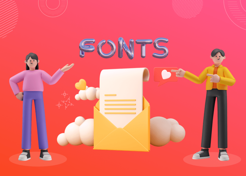
See how Nordstrom has used an attractive 3D typography for their Cyber Monday email. Just make sure that you implement these typography ideas in the form of static images or animations to avoid any rendering issues.
