

The role of colours in web design can’t be overstated. And that’s not just because they contribute to the overall visual identity of your brand, but also because they can bring some tangible, immediate results. This includes increasing conversions and sales on your landing pages.
Colours can evoke emotions, convey a message, direct people to certain parts of pages, or encourage them to act. It’s well-proven that proper use of colours can significantly affect your bottom line.
For instance, research has shown that full-coloured ads in magazines get recognized 26% more often than black-and-white ones. Keep in mind that users make a subconscious judgment about a product or environment within the first 90 seconds. And colour alone drives around 60-90 percent of that judgment.
So how do you make these facts work to your advantage? Here are some helpful tips and things you need to know about using colours on your landing pages.
The Symbolism of Colors
First of all, there are no unconditionally right or wrong colours for your landing page. Your choice should depend on many factors. These include your industry, your target market, the emotions you want to evoke, or the unspoken message you’d like to send out. So there are right or wrong colours only in the wider context of your brand, your audience, and your intentions.
That’s why it’s good to know what each colour signifies, which feelings it induces, and how it will affect the users on a subconscious level.
Blue
Blue is the colour of the ocean and vast space. It suggests calmness, stability, reliability, strength, and peace of mind. Some of the biggest companies in the world, such as Facebook, Intel, IBM, and Samsung, use blue as the basis of their brand’s visual identity.
It’s also used by health and wellness companies when they want to build trust. Take a look at how GetSafe, a medical alert system manufacturer, designed their homepage.

Source: getsafe.com
The space above the fold is dominated by a calming, soothing shade of blue. When you scroll further down, a similar nuance is used for key page elements, such as headlines and CTAs. This contributes to the image of a dependable, trustworthy partner that won’t fail in doing an obviously very important job.
Red
When it comes to red, it’s a colour associated with a wide array of different emotions and concepts. It’s supposed to incite strong feelings, whether it’s love, hate, power, passion, or panic. In web design, it can be used to draw attention, fire up users, or encourage action. It’s especially convenient for landing pages since it creates a sense of urgency and boosts impulse buying.
Red is also used by a number of corporate giants that want to show the dynamic, tireless nature of their brand. This includes Coca Cola, Toyota, CNN, Nintendo, Virgin, and many others.
Yellow
Usually, the way we see and interpret different colours is associated with some of our primal instincts. This interpretation comes from some of the oldest parts of the human brain, and it is conditioned by how these colours affected our ancestors in their everyday environment.
In this sense, yellow is primarily the colour of the sun. We relate it to warmth, happiness, and peaceful sunny days. It’s often used by family-friendly brands and companies that sell furniture and home appliances, in order to appeal to the sense of safety and emotional closeness.
A good example of that is IKEA. Yellow should emanate the warmth we relate to our homes and our families, which is just the emotion that a company that sells furniture and home accessories would want to evoke in us.
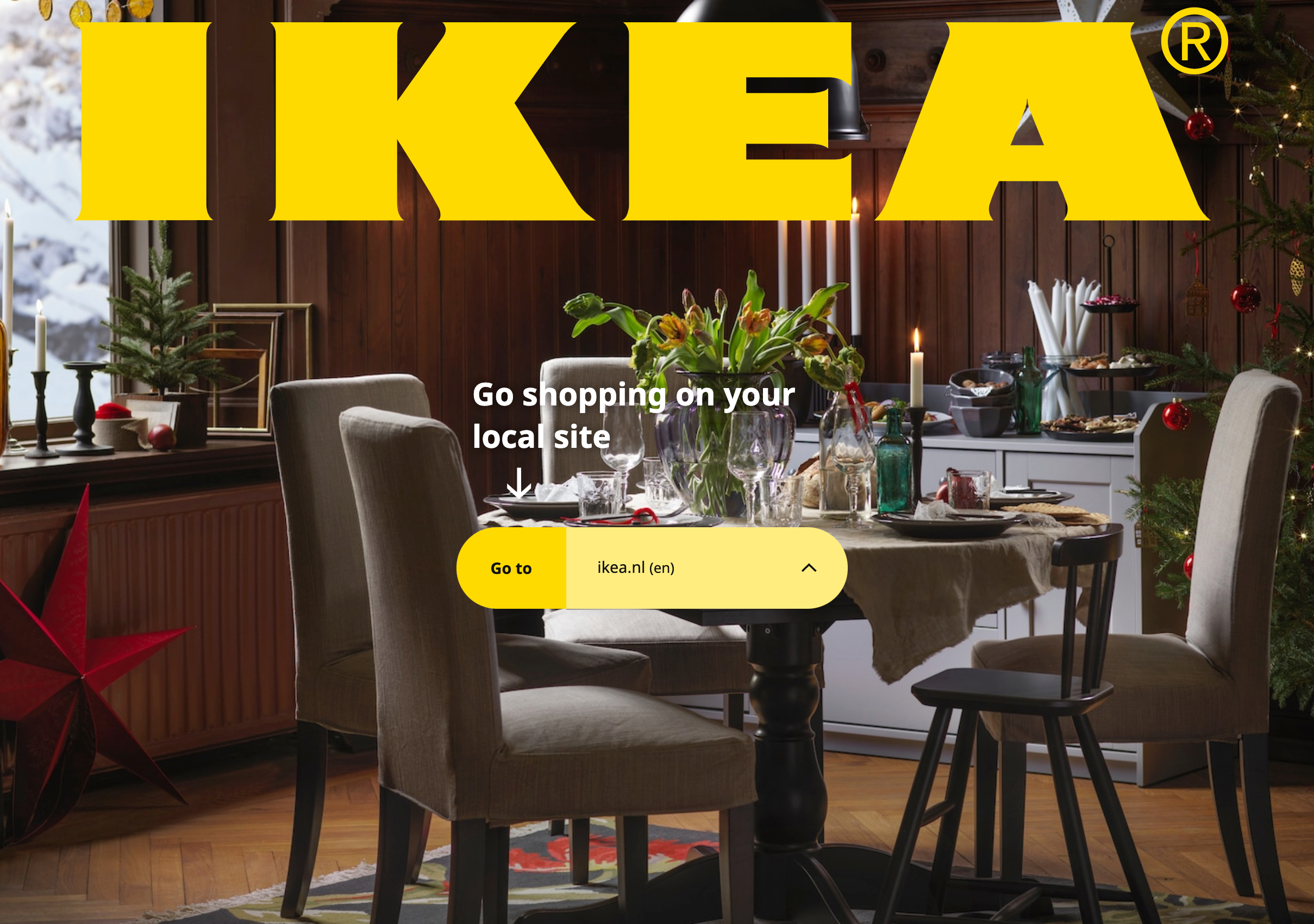
Source: ikea.com
Somewhat paradoxically, strong nuances of yellow can also symbolize caution, so using them to emphasize key parts of a page is a good idea as well.
Green
Obviously, green is the colour of nature, and it’s used to underline a deeper connection with ourselves and our roots. On the other hand, it’s also the colour of dollar bills, so we relate it to prosperity and financial wellbeing.
The “natural” aspect of the colour green is especially utilized by eco-oriented businesses, food companies, and health brands focusing on natural products. For instance, healthy-eating brand Ultimate Meal Plans uses a lot of green in their copy, CTA buttons, and illustrations.

Source: ultimatemealplans.com
There’s even a lot of green in the photos they’ve chosen to display. The heavy use of green should encourage people who are thinking about embracing a healthier lifestyle to stop thinking and take immediate action.
Purple
When choosing colours for your landing pages, it’s vital to understand your target market. Naturally, this includes getting familiar with the colours they like or dislike.
Different genders and age groups have very different preferences in this respect. For example, men tend to dislike purple – less than 1% of them would say it’s their favourite, and more than 20% of them consider it to be their least favourite colour. On the other hand, women’s answers are very different, as 23% of them find purple to be the most appealing of all colours.
Apart from being normally associated with luxury and nobility, the colour purple is apparently very popular among women. That’s why you can often see it used by fashion or beauty brands. Check how Cindy Crawford’s Meaningful Beauty takes advantage of this fact subtly and with style.
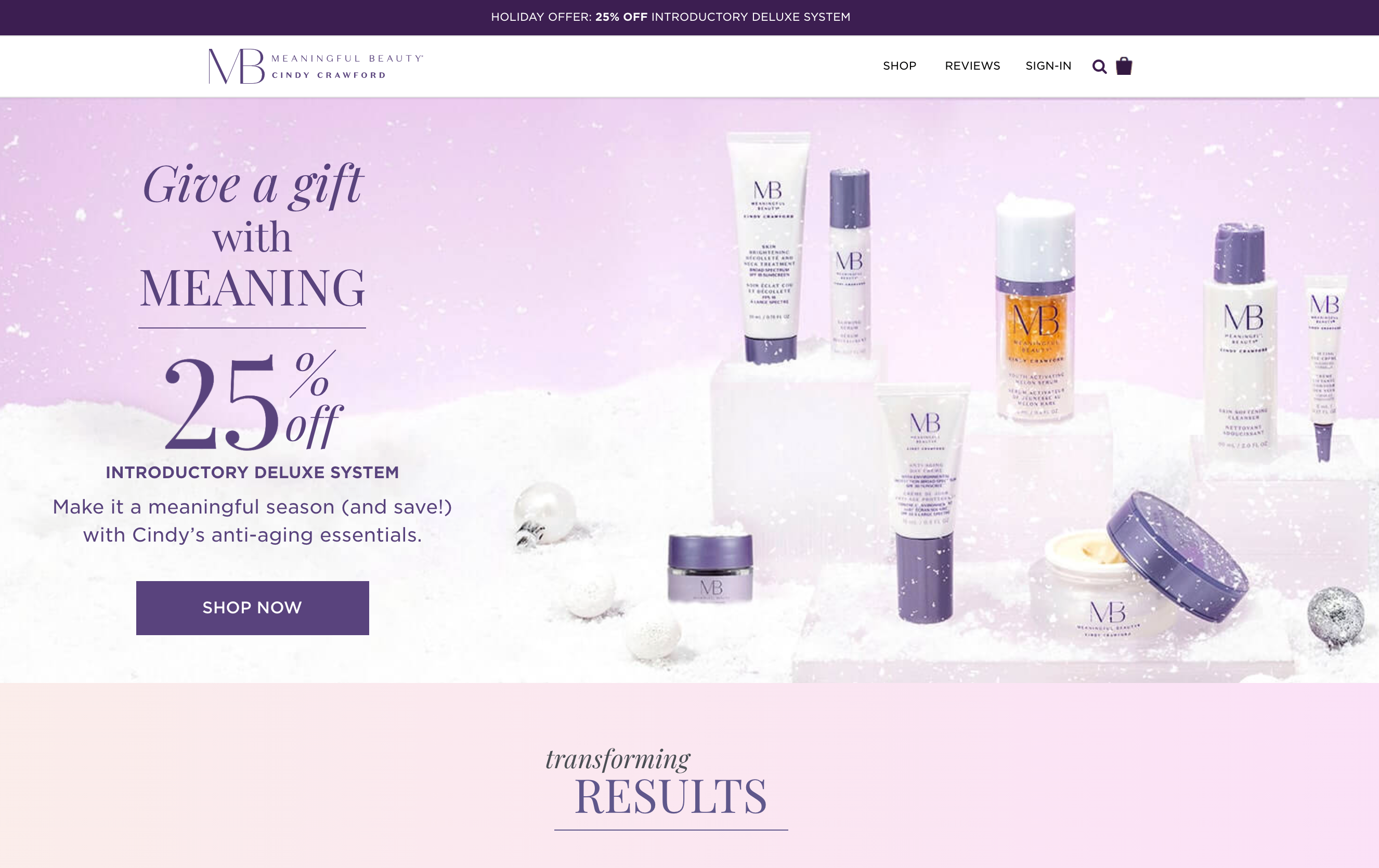
Source: meaningfulbeauty.com
Colour Schemes and Combinations
Now, of course, the way you combine the colours you’ve picked will be of utmost importance. There are too many factors here, and there are endless possible combinations that can work for any sort of brand. Some experts claim you ought to adhere to the 60-30-10 rule, which means you should use around 60% of the main colour, 30% of the secondary colour, and 10% of the accent colour. But it won’t really work every single time.
The same goes for the number of colours you should use. Sometimes, it’s ok to get a bit flamboyant, while other times, two colours are all you need. Take a look at how Revolve, a U.S. advertising agency, proves this with brilliant use of black and white.
Whitespace
Another important issue you’ll have to consider is the use of white, specifically as the background or the “empty space” between paragraphs and design elements. Today, people are absolutely overwhelmed with enormous amounts of information and content, so you’ll actually gain more by letting their eyes get a bit of a rest as they scroll through your landing page.
Whitespace also improves the readability of your copy and makes the page look more professional and less in-your-face. Plus, it ensures a smooth and relaxing experience for the visitor. Companies that sell health products or address a particularly stressed out audience should try to capitalize on this.
Somnifix, a company that produces mouth tapes that reduce snoring and improve sleep quality, has done an especially good job in this context.

Source: somnifix.com
A lot of whitespace and great use of a calming, pastel nuance of blue is a good way to make their visitors comfortable and get their attention.
CTA Color
All the pieces of advice we’ve been through so far won’t help you one bit if your CTA buttons are badly designed. If your Buy or Subscribe button isn’t obvious or engaging enough, all the other design work you’ve done to increase conversions and sales basically amounts to nothing.
There are very few rules when it comes to choosing colours for CTA buttons. Again, it depends on many factors, and the ideal colour will vary depending on your visual identity and your target audience. Nevertheless, it’s absolutely critical that the CTA button is visible enough, which means you should go for brighter, stronger colours that contrast the rest of your page.
It’s also advisable to pick one colour as an action colour and stick with it. This way, you won’t be confusing the visitors, and they’ll have no dilemma about which page elements are action buttons. Take Subway, for instance.

Source: subway.com
They use the same green for CTA buttons throughout the entire page, no matter whether the button reads Join Now, Start order, or Buy Gift Card. This creates visual consistency that will help consumers find their way around.
Final Word
All in all, there’s no universal formula that brings results when it comes to picking the best colours for your landing pages. These will naturally differ for various industries and businesses, so your choice will have to be based on a number of specific circumstances.
The key here is to get to know your audience and understand what causes them to take action. Only then can you apply the lessons from colour psychology and, together with your designers, choose the winning combination.
With Crowdfire, you can find curated content, schedule your posts, engage with your audience, deep-dive into analytics and create custom reports. Now introducing Social listening. Try it for free.
One comment