
Have you ever come across a page on Instagram and just gone, ‘Damn! That looks good!’
You might not even care whose page it is or what they’re selling, umn if they’re selling.
All you see is how polished it looks and awe at the fact that an Instagram feed can look this appealing.
Editing apps have opened the doors to creative, out-of-the-box thinkers that have given us so many different ways to manipulate the way our feed page presents. The first person who decided to play around with the Instagram squares is certified genius!
First impressions are as important in the virtual world as they are in the real world. The first look at your Instagram feed is what will pull your audience in. Which means you can’t have a boring, dull theme or layout. Unless that’s your aesthetic of course. 😉
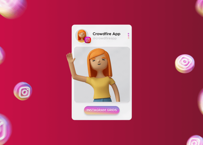
Since the pandemic, people have had more time on their hands to play around and experiment with Instagram Grid Layouts. This has given us enough time to research, plan Instagram feeds, and understand which layout works best for us.
But if you haven’t researched and don’t know which layouts you should test, look no further!
Here’s a list of 4 types of layouts that I find to be the most used. Using any of these layouts is sure to get you more views and followers. Read on!
1 . Checkerboard or Tiles
This grid layout might be considered the neatest and organized looking one. Whether you’re a checkers lover or not, this layout, if properly executed can become your canvas to share your story. Or build your business.
How can you master it, you ask? Simple! The key is to have all your posts made according to 2 types of content. Meaning, you can alternate your posts based on the color tone, alternating between light and dark tones. This can be used for quotes and images. Or alternate between brown and green/blue for earthy or sky tones which are mostly used by travel bloggers. If you’re marketing a business, you can alternate with the business theme colors too.
Here are some examples of the different uses of the Checkerboard layout:
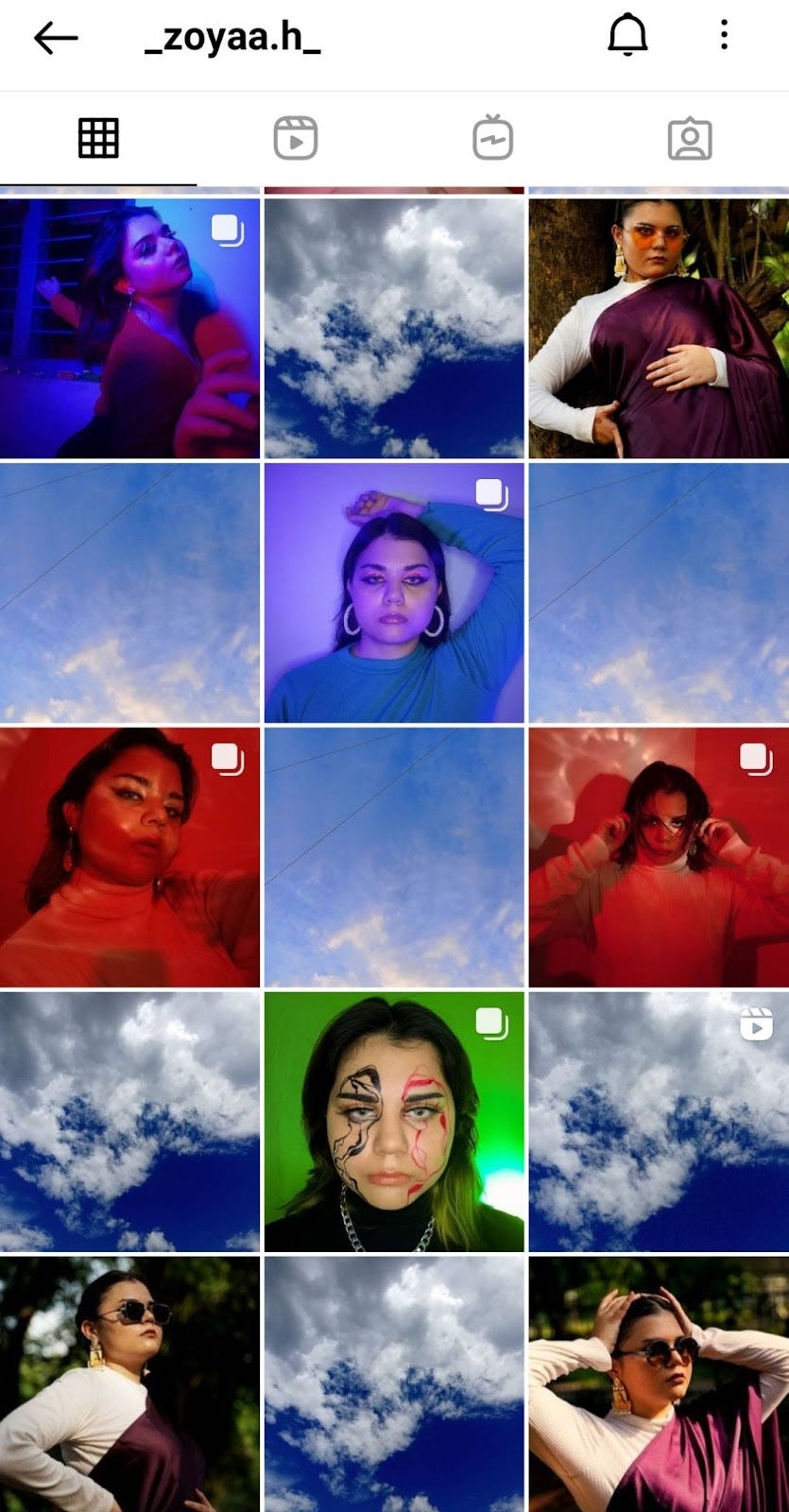
1. Creator _zoyaa.h_ uses pictures of the sky to alternate with her images. In another section, she also uses a black square to alternate with her images. She has even used a black thumbnail for her videos to stick to the order.
 .
. 
2. Travel blogger jackharding alternates between light and dark tones from their images and brandoneckroth also does something similar where the darker tones in the images have browns or greens and lighter tones have whites or sky blues.


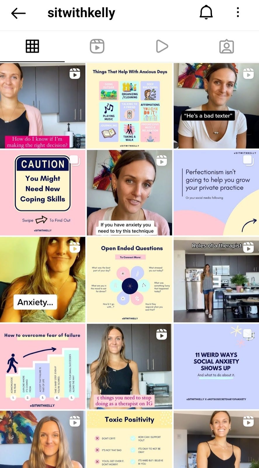
3. Businesses like beseenopticssd and sitwithkelly use their business theme colors for the checkerboard effect. Be Seen Optics uses its orange with text to alternate between product images. Kelly uses pink, yellow, and purple pastels in her text post backgrounds to alternate with her videos. This not only gives the checkerboard effect but also ‘Columns for Vertical Lines’.

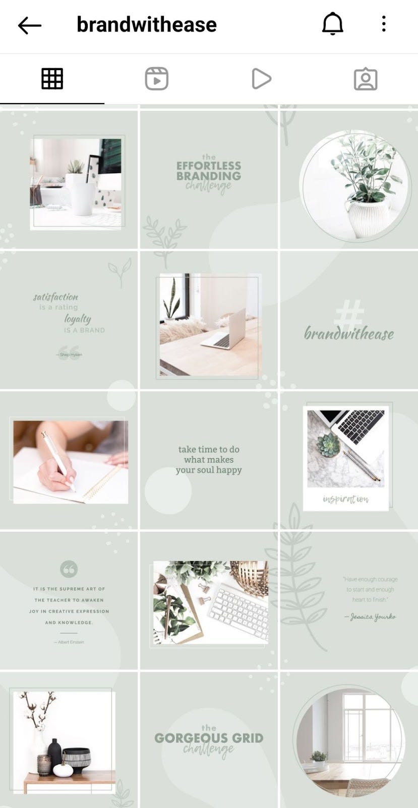
4. Canva and branding coach brandwithease uses this layout on her Instagram feed to alternate between images and quotes. She has also made expert use of the Puzzle grid layout that visually links all her posts. I will be covering more on the Puzzle layout below in point 4.

2 . Columns and Rows
This layout works best when you have too much to say for just 1 post. You can create a row of 3 posts to cover everything. This can be recipes, quotes, and meanings, descriptions/images of each place you traveled to, and the list is never-ending.
To be able to organize your posts as per this layout, you may need to use a tool like ‘The Preview App’ The app helps you arrange all your ready content as per your preference or requirement and gets them ready to post in order. If you stick to 1 format, you’ll even start to notice a mix of the 2 styles.
Here are some examples of how people used the Column, Row and a mix of both for their Instagram feed:
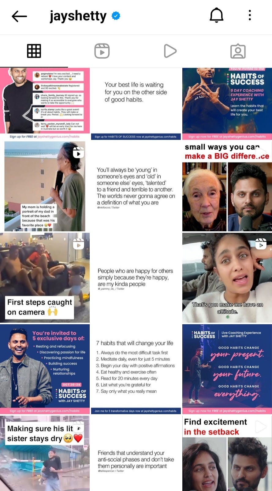
1. Creators like smittencurve and jayshetty use the Column layout on their feed. Vaidehi uses the middle line for her text posts and the left and right as her images relating to the content. Similarly, Jay uses the middle line for text posts and the left and right for his videos.

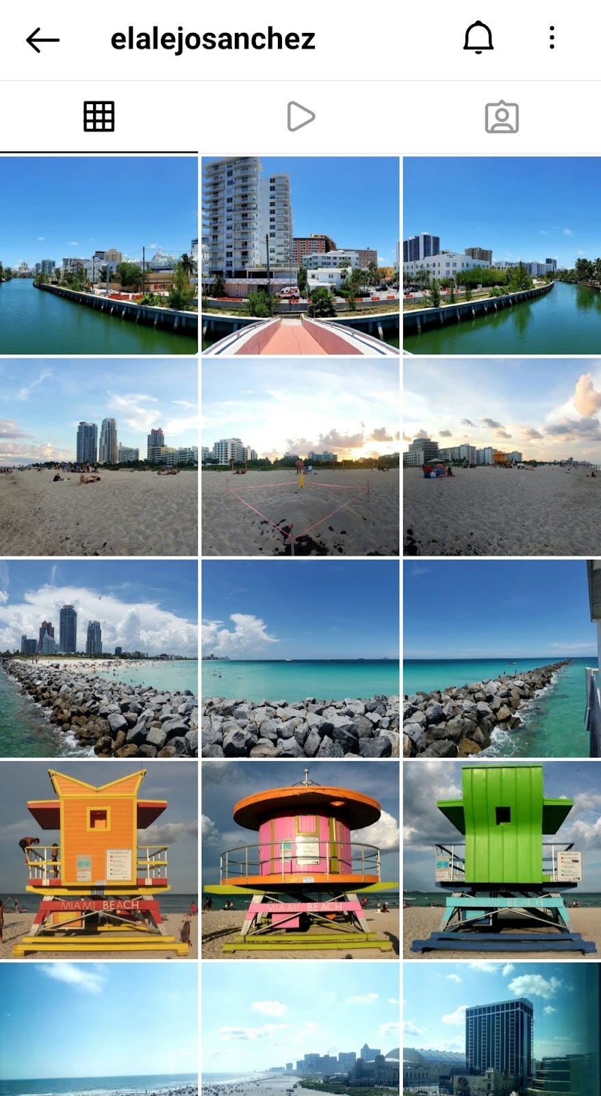
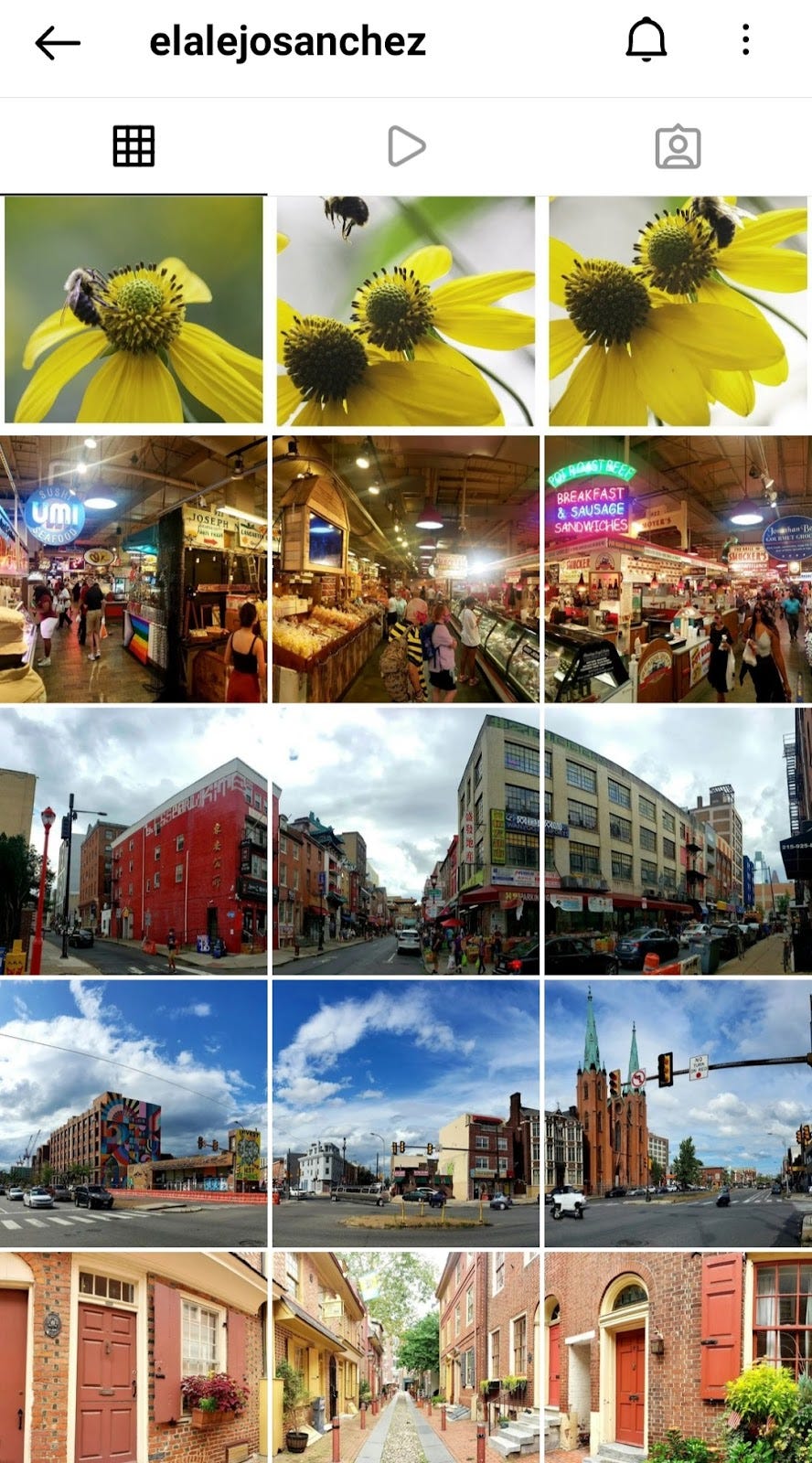
2. Conservationist and photographer elalejosanchez uses Rows to showcase his travels and photography skills.
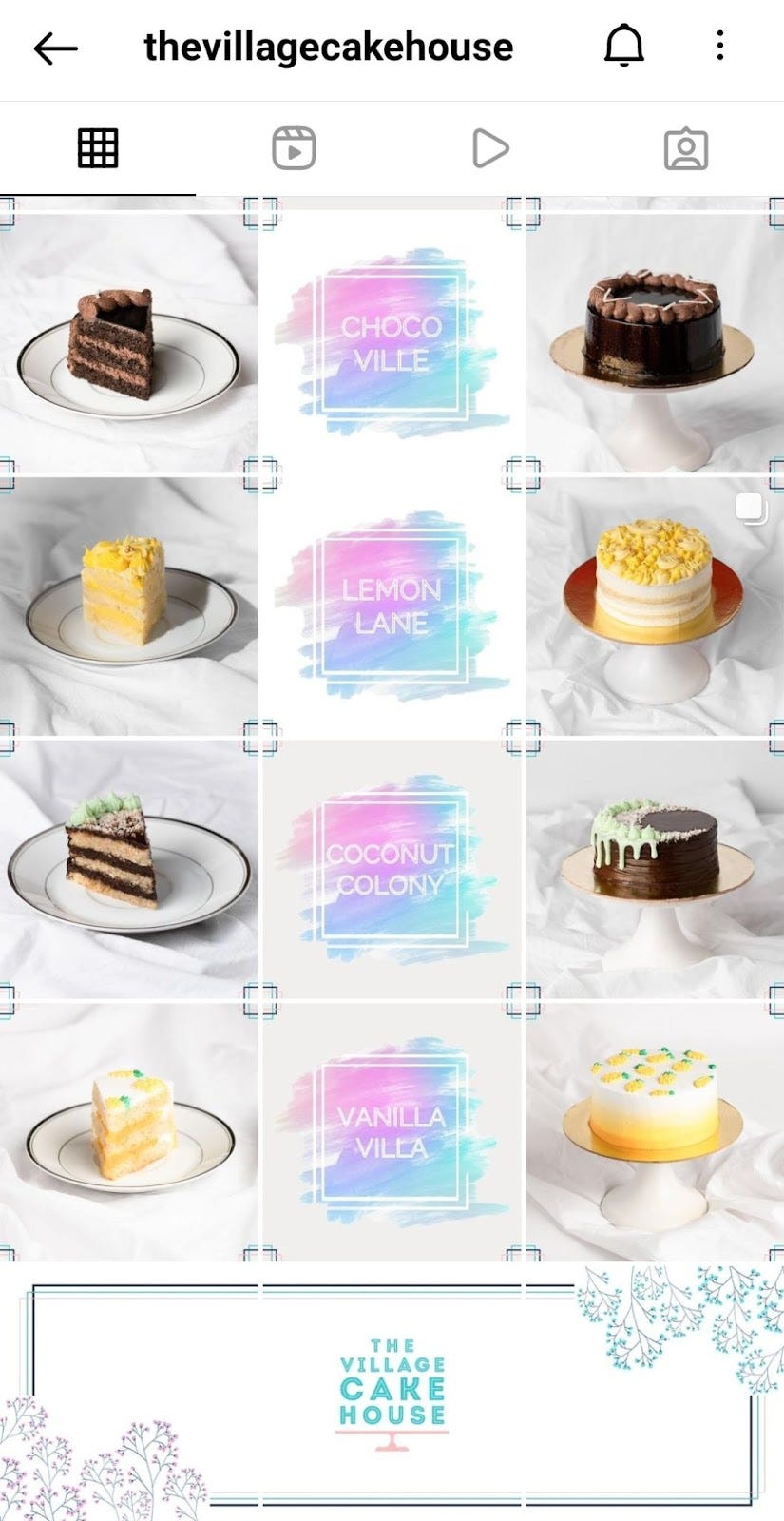
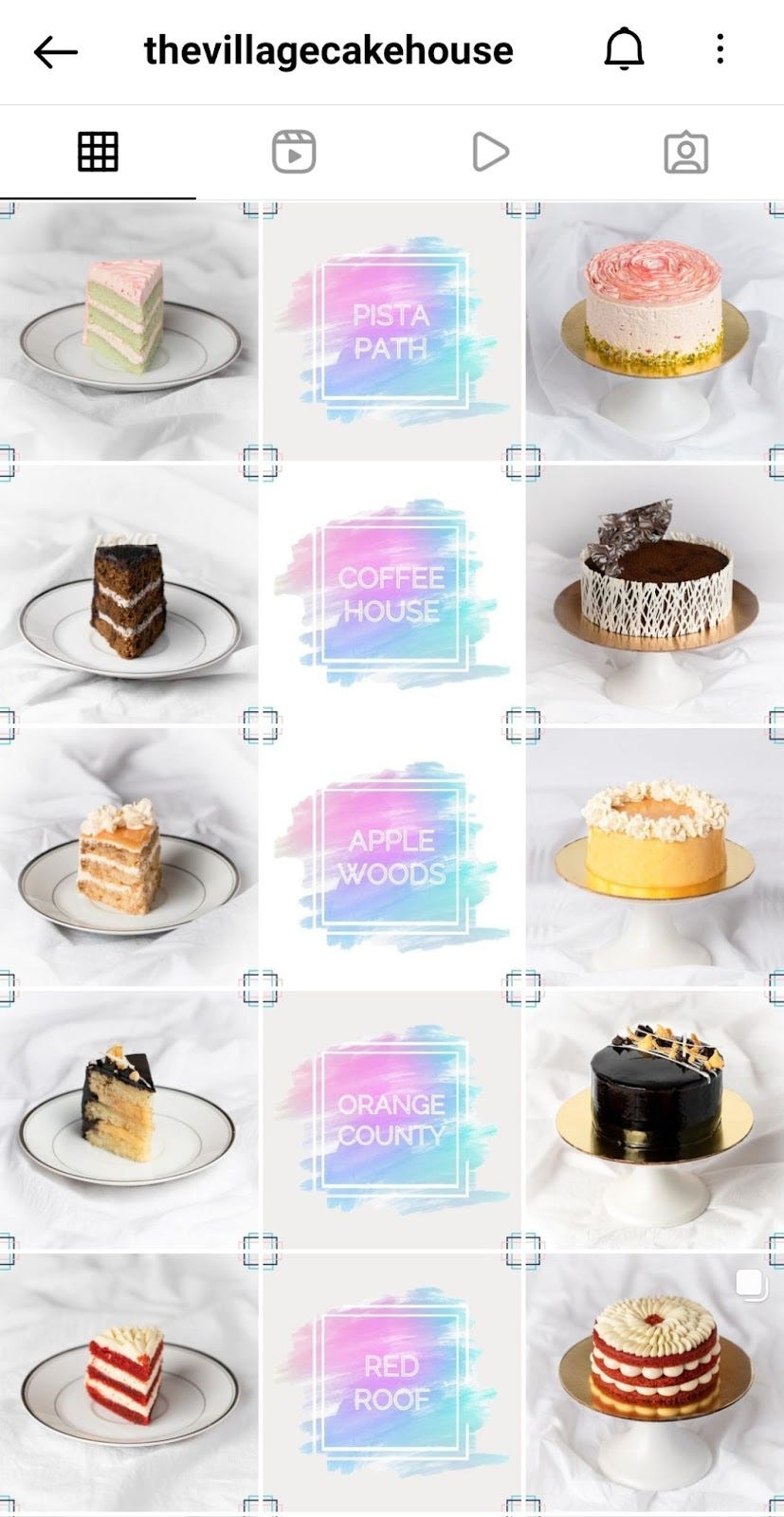
3. Dessert shop thevillagecakehouse started their feed with rows dedicated to a particular flavor of cake. But when you look at the feed after enough content is published, it looks like a mix of the 2 layouts. Columns to show what a cut piece looks like, the name of the flavor, and the full cake.
3 . Borders
This layout is probably the easiest to execute and the results still manage to blow my mind.
You can use different kinds of borders, but I find using a white border tends to bring some order, discipline, and calmness to your feed.
You can use photo editing apps like Canva to save border templates and directly post them to your Instagram feed.
Here are a few examples of how you can use borders to make gorgeous Instagram feeds:
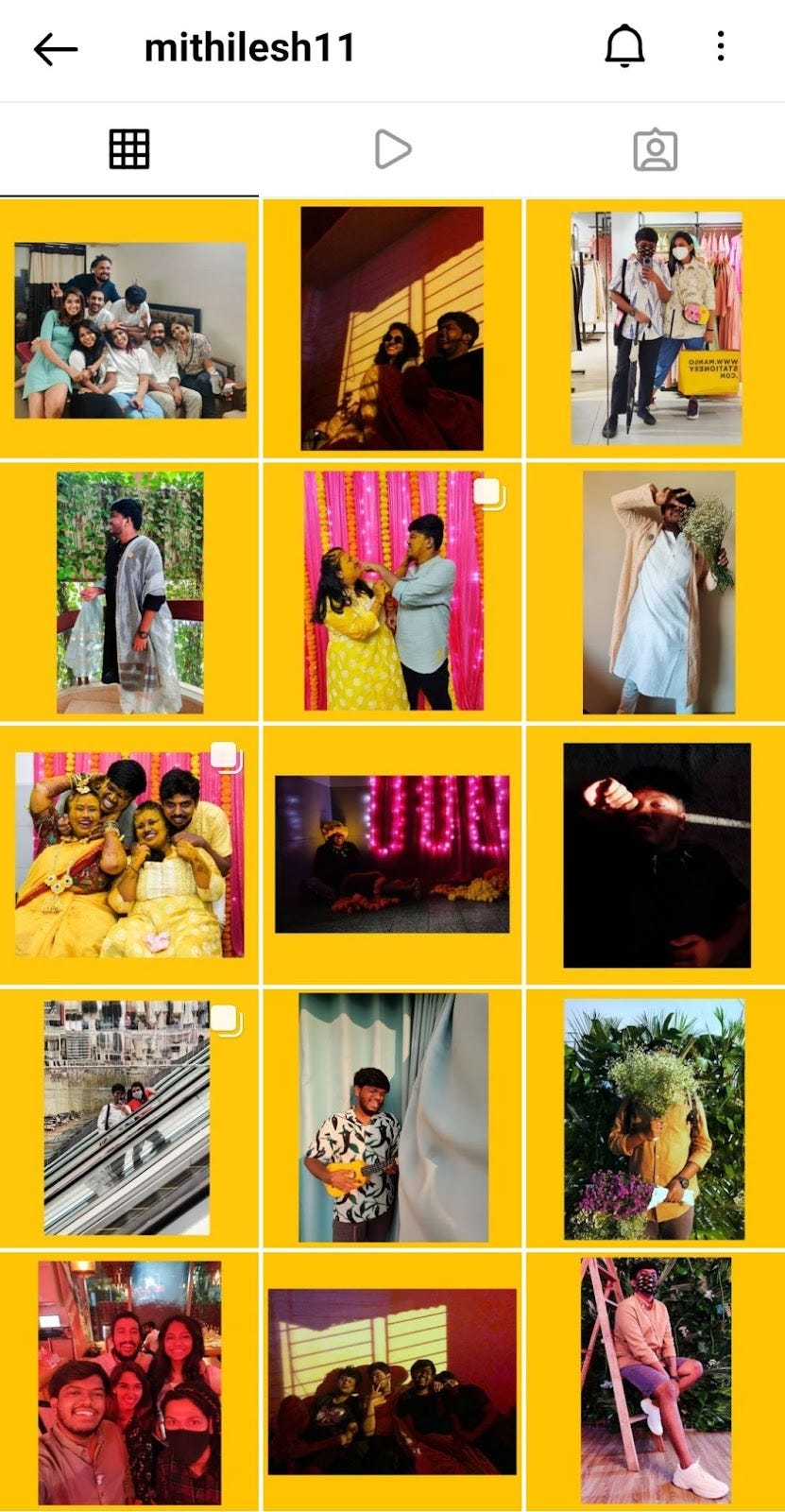
1. Artist and illustrator mithilesh11 uses yellow as a border for his posts making his feed unforgettable. He also uses a black border in his other account onelast_illustration

2. Bloggers and creators like gwenfernandes and charu.wrote.this uses white borders for their posts. While Gwen uses a standard template that makes her feed look neat and organized, Charushi goes for a more chaotic look, which is still somehow just as calming.


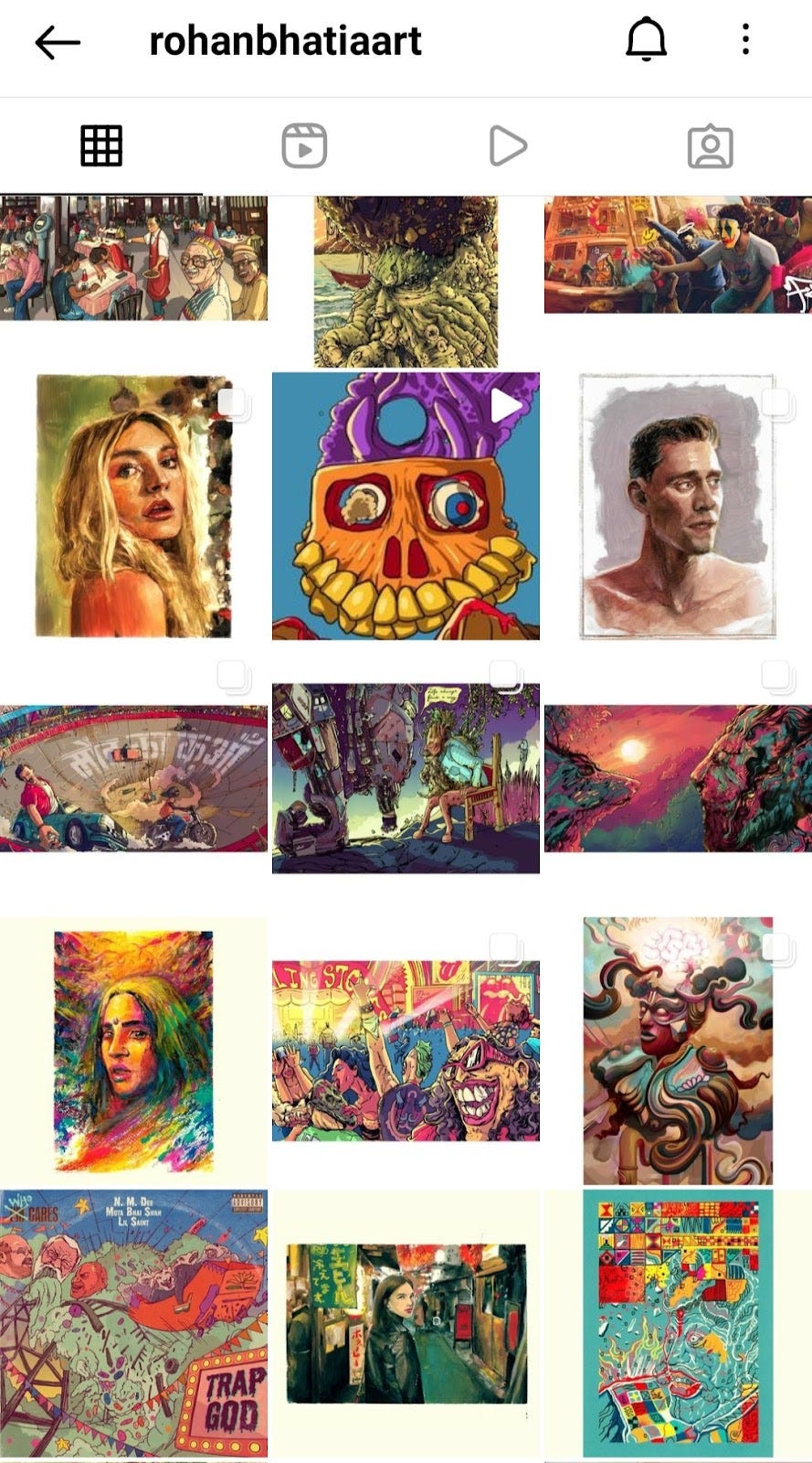
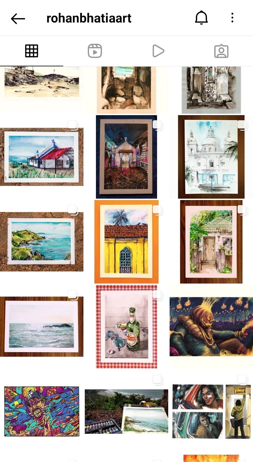
3. Animator and illustrator rohanbhatiaart uses a plain white border and also sometimes borders the artwork before using the white border.
4 . Puzzle or Continuous
This layout is definitely the best, most creative, most complex, and would definitely be the most difficult to execute; But, if you have the right idea, content, and tools, you will probably have the most interesting feed among all your peers or competitors.
Again, The Preview App will be an immensely huge help when it comes to planning, creating, and executing your content for your Puzzle/Continuous feed.
It is also extremely important to have high-quality images since it needs to be split and then published in order.
Here are some examples of how people used this layout for their Instagram feed:
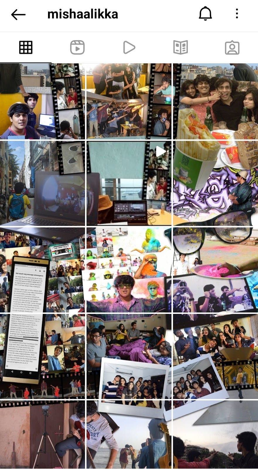
1. Creators like mishaalikka used this layout to create collages of their memories. It can definitely be used as a scrapbook for memories.
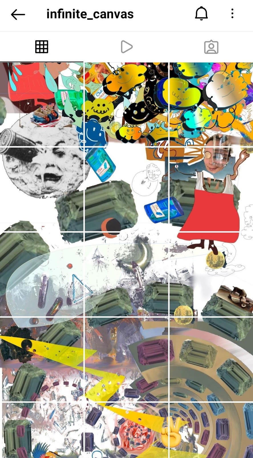
2. Artists and illustrators like infinte_canvas and onelast_illustration use it to showcase their creative minds. While one user quite literally uses the Instagram feed as an infinite canvas, the other uses sections for different ideas. Mithilesh’s most recent section is his Inktober sketches.

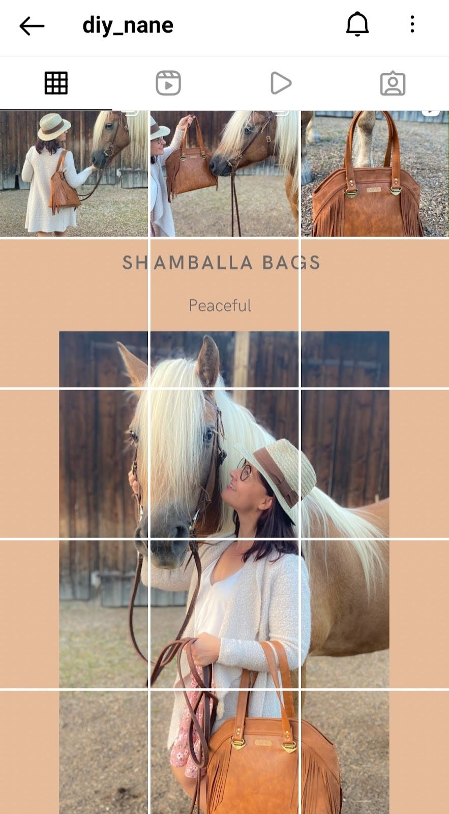
3. Blogger diy_nane uses the layout to showcase new products. Regina also uses a mix of the puzzle and rows layout. Businesses can also use the same logic to showcase their own products.

So yeah, ummmn

Here are some other helpful articles to optimize your Instagram account!
- 11 Content Ideas for Instagram Reels
- 7 easy to create Instagram themes
- 5 Instagram how-tos that you must know
- 11 Social Media Design Trends 2021
- A Detailed List of Notable Instagram Marketing Features
Let me know if you found this article helpful in the comments below!